Business Cards 10.30.26
What Is Blind Debossing? The Minimalist Luxury Finish Explained

Daniel Cantor
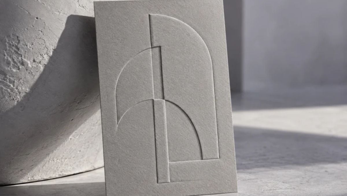
In premium stationery and business card printing, luxury does not always have to be shiny, colorful, or visually extravagant. Sometimes, the most sophisticated designs are defined by subtle details that invite people to look closer and feel the quality of the materials. Blind debossing is an excellent example of this approach. By pressing a design into paper without using ink, foil, or additional color, this finishing technique creates an understated impression that relies on depth, texture, and the natural interaction of light and shadow.
For businesses, designers, and professionals looking to create memorable printed materials, blind debossing offers an opportunity to communicate elegance through simplicity. Whether you are developing a minimalist corporate identity or exploring premium business card design nyc options, understanding this finish can help you make more informed design decisions. At Japan Printing, we specialize in stationery design and printing, including custom business cards. Contact our team today to request a quote and explore how we can bring your next business card project to life.
What Is Blind Debossing and How Does the Printing Process Work?
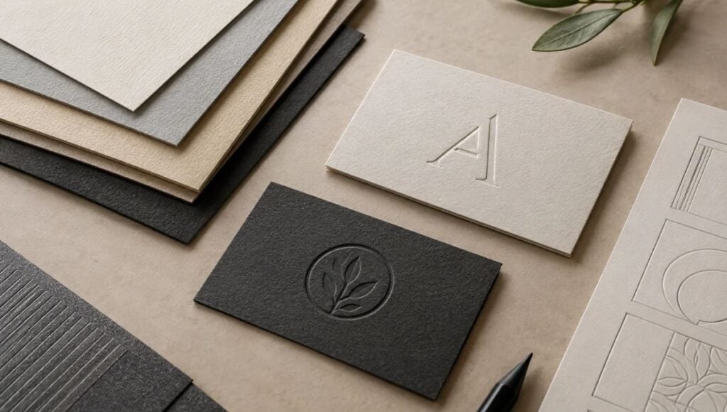
Blind debossing is a specialty printing and finishing technique that creates a recessed impression on paper or cardstock without applying ink, metallic foil, or other colored materials. The word “blind” refers to the absence of ink or color, while “debossing” describes the physical indentation created on the material’s surface. Unlike conventional printing, which places ink or toner onto paper, this process changes the paper’s physical structure to produce a design that can be both seen and felt.
The technique generally involves a custom-made metal die containing the artwork that needs to be impressed into the paper. During production, the die applies controlled pressure to the selected area of the cardstock, creating an indentation that follows the shape of the design. Depending on the equipment, material, and production specifications, heat may also be involved.
The resulting impression becomes visible through subtle differences in surface depth, light reflection, and shadow. This makes the finish particularly interesting because the design does not depend on contrasting colors to attract attention.
A typical blind debossing process involves several steps:
- Artwork preparation: The logo, typography, monogram, or decorative element is prepared as production-ready artwork. The design must account for the limitations of the chosen material and finishing process.
- Die production: A specialized die is manufactured to reproduce the selected design accurately.
- Material selection: The appropriate paper or cardstock is chosen according to its thickness, texture, composition, and ability to retain the impression.
- Pressing: The die applies pressure to the material, creating the recessed design.
- Quality inspection: The finished pieces are checked for impression consistency, positioning, and overall appearance.
Because the finish is created through physical pressure rather than printed color, every aspect of the production process matters. Paper selection, die quality, pressure, and artwork preparation all influence the final result.
Why Blind Debossing Is Associated With Minimalist Luxury
Blind debossing has become an appealing option for premium stationery because it communicates sophistication without relying on conventional decorative elements. Rather than using bright colors, metallic effects, or glossy coatings, it allows the material itself to become an essential part of the visual identity.
This approach is particularly relevant to minimalist design, where unnecessary visual elements are removed to emphasize proportion, typography, negative space, and material quality. A small recessed logo on a thick business card, for example, can create a distinctive brand impression without overwhelming the composition.
The luxury appeal of blind debossing comes from several characteristics:
- Subtle visual contrast: Since no ink or foil is applied to the debossed area, the design is defined by its physical depth rather than a different color.
- Tactile interaction: People can feel the recessed details when handling the printed piece, adding a sensory dimension that conventional flat printing does not provide.
- Material-focused aesthetics: The paper’s natural color, texture, and surface characteristics become part of the design.
- Understated branding: Companies can communicate a refined identity through a carefully positioned logo or monogram instead of large, attention-grabbing graphics.
- Visual simplicity: The technique works particularly well with restrained layouts that use whitespace and a limited number of design elements.
Blind debossing is especially suitable for brands that want their stationery to feel considered and distinctive. Professional service providers, architecture studios, boutique agencies, luxury retailers, creative businesses, and high-end hospitality brands may find this finish particularly appealing.
However, luxury is not determined by the finishing technique alone. The quality of the cardstock, the precision of the impression, the proportions of the design, and the overall printing execution all contribute to the final experience. A thoughtfully designed card with a subtle debossed detail can communicate more refinement than a complicated design featuring several competing effects.
Ultimately, blind debossing demonstrates how a physical detail can contribute to brand perception without demanding immediate visual attention. Its appeal lies in the balance between simplicity, craftsmanship, and tactile quality.
The Best Paper Stocks and Design Elements for Blind Debossing
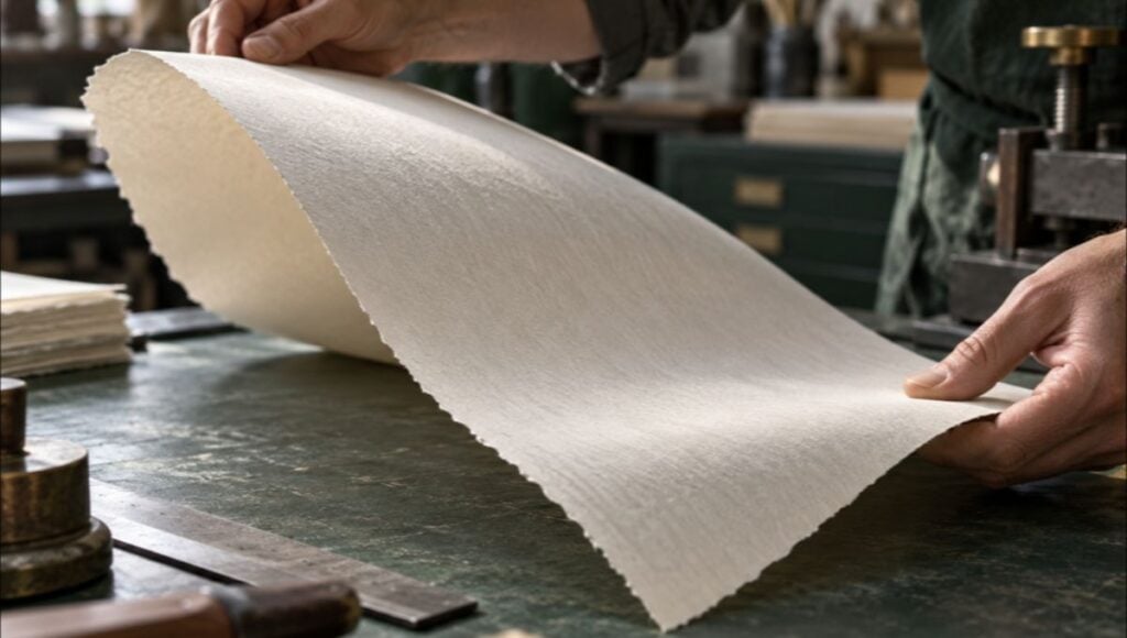
Choosing the right paper is one of the most important decisions when planning a blind debossing project. Since the technique relies on physically compressing the material, not every paper stock will produce the same result. The thickness, fiber composition, texture, and surface characteristics of the cardstock can influence how clearly the impression appears and how well it holds its shape.
Heavyweight, uncoated papers are frequently recommended for this type of finishing because they can provide a suitable surface for creating a defined impression. Cotton-based stocks are also popular in premium stationery because their soft, tactile characteristics can complement the recessed effect. However, the ideal choice depends on the specific paper and production method, so testing samples before approving a large print run is advisable. <sup> </sup>
Some materials and characteristics worth considering include:
- Cotton paper: Known for its soft feel and suitability for premium stationery, cotton-based stocks can produce attractive tactile impressions.
- Heavyweight uncoated cardstock: Thicker materials generally provide more room for a defined impression, although the appropriate weight depends on the paper’s composition and the printer’s equipment.
- Textured paper: Certain textured surfaces can add another layer of visual and tactile interest, although pronounced textures may compete with or reduce the clarity of fine debossed details.
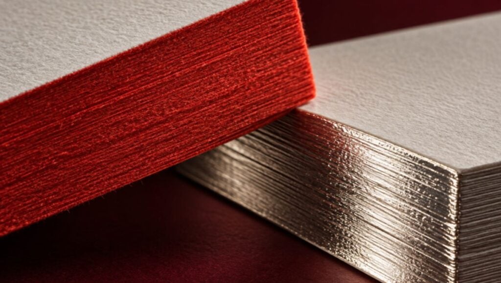
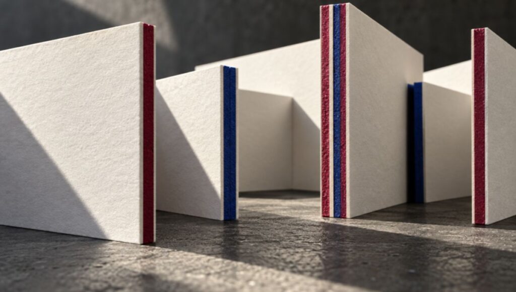
- Duplex or triplex cardstock: Laminating multiple paper layers can create thicker business cards, offering additional structural support for specialty finishing. The construction must be evaluated to ensure the desired impression is achievable.
Design decisions are equally important. Since blind debossing does not introduce a contrasting ink color, intricate details and very small lettering may become difficult to distinguish. Bold logos, geometric symbols, simple monograms, and well-proportioned typography are often more effective.
When preparing artwork, consider these recommendations:
- Prioritize recognizable shapes: Use clear graphic elements that remain identifiable when reproduced as a recessed impression.
- Avoid excessively thin details: Delicate lines and tiny text may not reproduce consistently, depending on the die and cardstock.
- Use negative space strategically: Give the debossed element enough room to stand out without competing with surrounding design components.
- Consider both sides of the card: Pressure can leave a visible impression or distortion on the reverse, so plan the layout accordingly.
- Request physical samples: A printed proof or production sample helps evaluate impression depth, paper texture, and legibility before approving the final project.
The goal is to create a design in which the paper and the impression work together rather than compete for attention.
How to Use Blind Debossing in Premium Business Cards and Stationery
Blind debossing offers several creative possibilities for businesses looking to develop distinctive printed materials. Although it is frequently associated with luxury business cards, the technique can also be applied to other stationery products, including invitations, presentation folders, greeting cards, letterheads, and selected packaging applications.
For business cards, one of the most effective approaches is to use blind debossing as a focal point rather than applying it to every element. A company logo pressed into the front of a thick, uncoated card can establish a refined visual identity while leaving the contact information clear and easy to read through conventional printing.
Here are some practical ways to incorporate this finish into a business card design:
- Debossed company logos: Positioning a recessed logo on the front of the card creates a recognizable brand detail without introducing additional colors.
- Minimalist monograms: Initials or simplified brand symbols can work particularly well when the overall design uses generous whitespace.
- Subtle borders and patterns: Recessed lines or geometric patterns can add texture while maintaining a restrained visual appearance.
- Back-of-card branding: A blind-debossed symbol or company name on the reverse can complement a front side containing printed contact information.
- Combined finishing techniques: Blind debossing can be paired with other printing methods, such as conventional ink printing or foil stamping, to create contrast between recessed and visually prominent elements.
For example, a professional services company could choose a heavyweight, natural-white cardstock with a blind-debossed logo on the front and black printed contact information on the back. The result would combine functional readability with a distinctive tactile feature.
Another possibility is combining blind debossing with metallic foil stamping. The foil can highlight selected brand elements, while the recessed areas introduce a contrasting texture. This combination should be planned carefully to ensure that the different finishes complement one another rather than make the design unnecessarily complicated.
Beyond business cards, the same principles can be applied to coordinated stationery collections. A company could incorporate a consistent debossed logo across its correspondence cards, presentation folders, and selected corporate materials, helping establish a recognizable visual language across different printed touchpoints.
It is also important to consider production costs. Blind debossing generally requires specialized tooling and an additional finishing setup, which can make it more expensive than standard flat printing. The final quotation will depend on factors such as die requirements, material selection, production quantities, and the complexity of the artwork. For this reason, discussing the design and finishing specifications with an experienced printing provider early in the process can help avoid unnecessary revisions.
Conclusion
Blind debossing is a distinctive finishing technique that demonstrates how luxury stationery can achieve visual impact through texture rather than color. By creating recessed impressions directly in the paper, it adds depth, tactile interest, and understated sophistication to business cards and other printed materials. Its success depends on selecting suitable cardstock, preparing artwork with sufficient detail and clarity, and balancing the impression with the overall design. For brands that value minimalist aesthetics and thoughtful presentation, blind debossing can be an excellent addition to a premium stationery project.
At Japan Printing, we help businesses transform their ideas into professionally designed and printed stationery, with custom business cards tailored to their branding and communication needs. Contact us today to request a quote for your business card design and printing project. Let our team help you explore premium finishes, select the right materials, and create business cards that make a lasting impression.