Stationery 11.20.26
Pantone Matching in 2026: When Does Your Brand Really Need a Spot Color?

Daniel Cantor
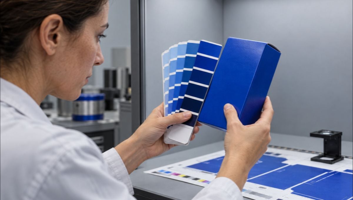
Color is one of the most recognizable elements of a brand identity. From a company’s logo to its business cards, letterheads, envelopes, and marketing materials, maintaining consistent colors across printed pieces helps establish a professional and recognizable visual presence. However, achieving that consistency is not always as simple as choosing a color on a computer screen. Different printing processes, paper stocks, ink formulations, and finishing techniques can all influence the final result. This is where the Pantone Matching System (PMS) becomes particularly valuable, especially for businesses that depend on precise brand colors.
In 2026, brands have more printing options than ever, including traditional spot color printing, CMYK, and extended gamut processes. But does every business need a dedicated Pantone ink? Not necessarily. Understanding when spot colors provide a meaningful advantage can help you make better production decisions without increasing your printing budget unnecessarily. If you are considering new stationery or professional business card design nyc, contact Japan Printing to request a quote for your business card design and printing project. Our team can help you choose the right colors, materials, and printing approach for your brand.
Understanding Pantone Spot Colors vs. CMYK Printing
The first step in deciding whether your brand needs a Pantone spot color is understanding how the two main printing approaches work. Although both can produce professional-looking business cards and stationery, they achieve color in fundamentally different ways.
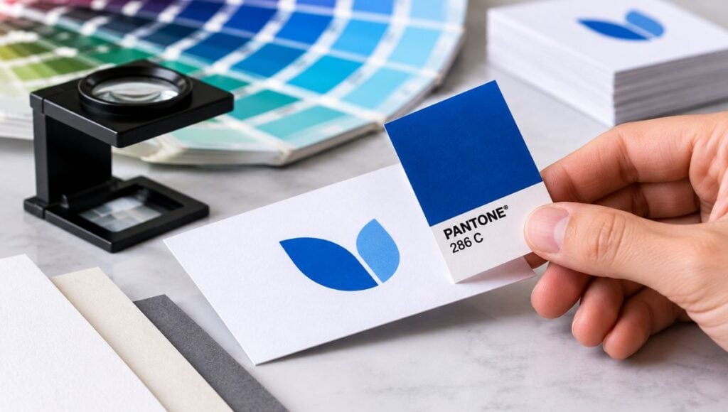
The Pantone Matching System is a standardized color identification and formulation system. In spot color printing, a specific ink is mixed before production according to a defined formula and applied as an individual color. Rather than combining several inks during printing to approximate a shade, the printer uses a dedicated ink formulation to reproduce the selected color.
CMYK, on the other hand, uses four standard process inks:
- Cyan (C): A blue-green ink used to reproduce blue and green tones.
- Magenta (M): A reddish-purple ink that contributes to reds, purples, and other colors.
- Yellow (Y): Used to create yellows and contribute to a wide range of mixed colors.
- Black (K): Adds depth, contrast, and definition while improving the reproduction of dark elements.
By combining these inks in different proportions and printing patterns, CMYK can reproduce thousands of colors, photographs, gradients, and complex illustrations.
According to Pantone, spot colors are particularly useful when a project requires a small number of precisely specified colors, such as corporate logos, stationery, and identity materials. CMYK is generally more practical for full-color images and complex designs. Spot vs. Process Color+1
For example, consider a company whose logo features a distinctive deep purple. If the logo appears on business cards, envelopes, folders, and letterheads, using a dedicated Pantone ink may help maintain a more consistent appearance across those materials. However, if the business card includes photographs, colorful backgrounds, and several gradients, CMYK may be the more efficient production method.
The important distinction is that Pantone and CMYK are not competing solutions for every project. They are different production approaches, and the best choice depends on the design, the desired color accuracy, the printing method, and the budget.
When Your Brand Actually Needs a Pantone Spot Color
Not every brand requires spot color printing, but certain situations make it a particularly worthwhile investment. The decision should be based on how important a specific color is to the company’s identity and how closely that color needs to be reproduced across different printed materials.
A Pantone spot color is especially worth considering when:
Your logo depends on a highly specific brand color. Some businesses use distinctive shades that customers immediately associate with their identity. If a particular blue, green, red, or orange must remain visually consistent, a dedicated ink formulation can offer greater control than a CMYK approximation.
Your company produces multiple stationery items. Businesses that regularly print business cards, letterheads, envelopes, presentation folders, and other branded materials may benefit from specifying the same Pantone reference throughout their print specifications. This provides a common color standard for communication between designers and printers.
Your design uses bright or difficult-to-reproduce shades. Certain saturated colors fall outside the standard CMYK color gamut. Pantone spot inks can reproduce some of these colors more effectively because they are mixed as dedicated inks rather than simulated through four-color combinations. What Are Your Color Spaces?+1
Your brand uses metallic or specialty colors. Metallic and certain pastel Pantone formulations are available as dedicated inks. These can provide visual characteristics that a conventional CMYK simulation cannot reproduce in the same way.
Before requesting spot color printing, consider these questions:
- Is the logo’s color a critical part of brand recognition?
- Will the same color appear on several printed products?
- Does the selected shade look noticeably different when reproduced in CMYK?
- Does the project justify the additional production costs?
- Can the printer accommodate the required spot ink and printing process?
For a business ordering a small batch of simple, two-color business cards, Pantone printing may be a sensible choice. For a promotional card containing photographs and multiple colors, CMYK might deliver better value. The goal is not to use Pantone everywhere, but to use it where color precision genuinely improves the final product.
How Paper Stock and Printing Conditions Affect Pantone Accuracy
Choosing the correct Pantone reference is only part of the process. The paper itself plays an important role in determining how a color looks once printed. Even when the exact same ink formulation is used, the final appearance can change depending on the paper’s coating, texture, and absorbency.
Pantone distinguishes between two important color references:
- Pantone C (Coated): Intended for coated paper stocks. Because the surface limits ink absorption, colors generally appear sharper and more vibrant.
- Pantone U (Uncoated): Intended for uncoated paper stocks. These papers absorb more ink, which can produce a softer or different visual appearance.
This distinction is particularly important when designing business cards and corporate stationery. For example, a company might choose a premium coated business card for its sales team but use uncoated paper for its letterheads and envelopes. Even if the same Pantone ink is specified, the two printed materials may not look identical. Pantone+1
Other production considerations also influence the result:
- Paper color: A naturally warm or ivory paper can change the perceived appearance of a printed color compared with a bright white stock.
- Paper texture: Textured and porous surfaces can affect how evenly ink is distributed and absorbed.
- Printing conditions: Ink application, press calibration, and production specifications influence color reproduction.
- Finishing: Laminations and other surface treatments can change the perceived appearance of the finished printed piece.
For brands investing in professional stationery, it is important to evaluate colors on the actual paper selected for production rather than relying exclusively on a computer monitor or a digital color reference.
A practical approach is to request a physical proof or production sample before approving a large order. This allows you to evaluate the combination of ink, paper, and finish under realistic conditions. When color consistency is a priority, designers and printers should also communicate the exact Pantone reference and whether the coated or uncoated specification applies.
Pantone Matching Strategies for Business Cards in 2026
In 2026, businesses have several ways to manage brand color reproduction without automatically committing to traditional spot color printing. The right strategy depends on the complexity of the design, the quantity being produced, the printing equipment available, and the level of color accuracy required.
One important option is Pantone Color Bridge, a reference system that compares Pantone spot colors with their closest CMYK equivalents. This makes it easier to determine whether a brand color can be reproduced satisfactorily using conventional process printing. However, the comparison is a visual reference rather than a guarantee of an exact match, since actual results depend on printing conditions and the substrate.
Another possibility is Extended Gamut Printing. This process expands traditional CMYK by introducing additional inks, commonly Orange, Green, and Violet (OGV). According to Pantone, its Extended Gamut system can provide substantially closer simulations of Pantone spot colors than standard CMYK for many applications.
There is also an interesting color reference for brands exploring contemporary design trends in 2026: PANTONE 11-4201 Cloud Dancer, Pantone’s Color of the Year. This soft, airy white demonstrates how a color can become an important part of a visual identity without necessarily requiring a dedicated spot ink. On business cards, a similar aesthetic might be achieved through the choice of white or off-white paper, negative space, and carefully selected complementary colors. The actual printed result will depend on the substrate and production method.
For a business card project, consider the following production strategies:
| Printing strategy | Best suited for |
|---|---|
| CMYK | Full-color designs, photographs, and complex graphics |
| Pantone spot color | Specific brand colors requiring precise ink formulation |
| CMYK + Pantone | Designs combining photographs with a critical brand color |
| Extended gamut | Wider color reproduction using additional process inks |
Before selecting a method, discuss the following with your printing provider:
- The exact Pantone reference and its coated or uncoated version.
- Whether the design requires one, two, or four or more printing colors.
- The paper stock, thickness, and surface finish.
- Whether the selected color can be reproduced adequately using CMYK.
- Whether the order quantity and production method justify dedicated spot inks.
A well-planned business card does not need the most complicated printing process to look exceptional. The best results come from matching the production method to the design’s actual requirements while maintaining consistency across the brand’s printed materials.
Conclusion
Pantone spot colors remain an important tool for brands that require precise color reproduction, particularly when their identity depends on distinctive shades that are difficult to replicate using standard CMYK printing. However, they are not essential for every business card or stationery project. In many cases, CMYK or Extended Gamut printing can provide excellent results while offering greater flexibility for complex designs. The most effective decision comes from evaluating the brand’s color requirements, paper selection, printing conditions, and production budget together. Ultimately, consistency is not simply about choosing a Pantone number; it is about ensuring that every printed element represents your brand as intended.
At Japan Printing, we understand that business cards are more than contact information: they are an important part of your company’s visual identity. Whether you need precise Pantone color matching, a sophisticated minimalist design, premium paper stocks, or a complete business stationery solution, our team can help bring your ideas to life. Contact Japan Printing today to request a quote for your business card design and creation project and discover the right printing solutions for your brand.