Business Cards 10.16.26
Why White Ink Is Becoming a Favorite for Modern Luxury Branding

Daniel Cantor
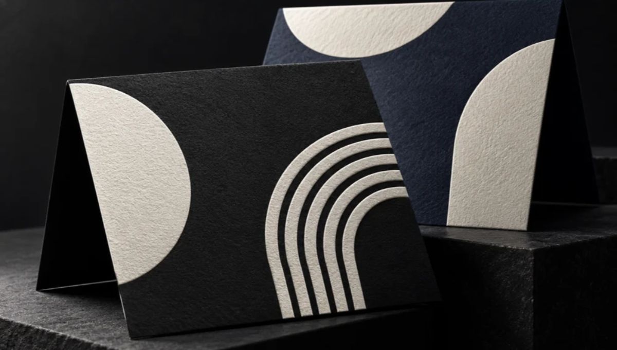
Luxury branding is evolving beyond traditional gold foil, glossy finishes, and elaborate designs. Today, many brands are embracing a more understated aesthetic, using carefully selected materials, minimalist typography, and distinctive printing techniques to communicate quality. White ink has become an appealing option for this approach, particularly when applied to dark, colored, or textured paper stocks. Its clean appearance and striking contrast can transform a simple business card into a memorable brand statement without overwhelming the design. From boutique retailers and creative agencies to luxury real estate firms and professional service providers, businesses can use white ink to create stationery that feels contemporary, intentional, and sophisticated.
The appeal of this technique lies in its ability to make every design element count. Whether you are developing a new visual identity or refreshing your existing stationery, the right combination of white ink, premium paper, and thoughtful typography can help communicate your brand’s personality. If you are exploring business card design nyc services, Japan Printing can help you develop a distinctive printed identity that aligns with your brand. Contact Japan Printing to request a quote for your business card design and creation project.
The Appeal of Minimalism and High-Contrast Luxury
Modern luxury branding often relies on restraint rather than visual excess. Instead of filling every available space with colors, decorative graphics, and multiple finishes, designers can focus on a small number of carefully chosen elements. White ink supports this philosophy by creating a clear visual contrast against dark or richly colored paper, allowing a logo, business name, or essential contact information to stand out.
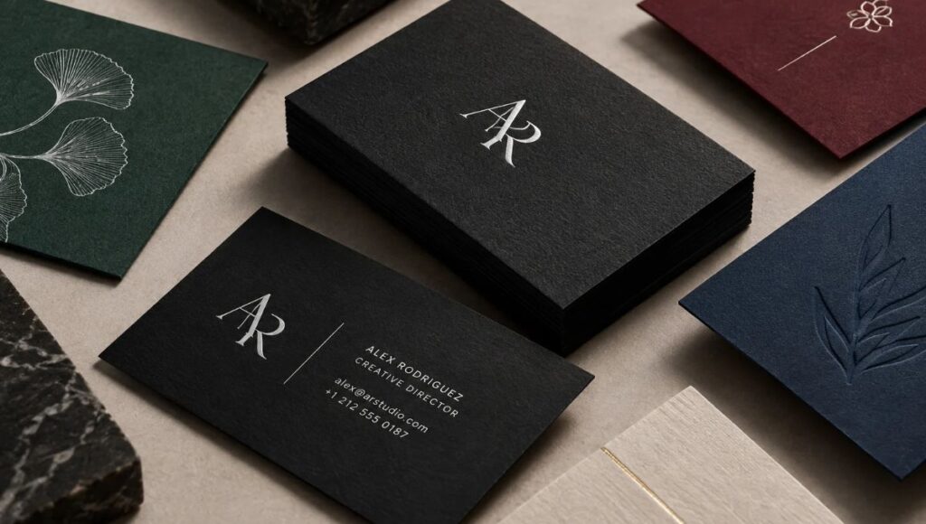
Consider a business card printed with a white monogram on deep black cardstock. The result can communicate sophistication through the relationship between the ink and the paper rather than through elaborate ornamentation. Similarly, white typography on navy, forest green, burgundy, or charcoal stock can create a distinctive identity while maintaining a restrained appearance. The final impression depends on the paper, the printing method, the design, and the quality of execution.
White ink is particularly useful when a brand wants to maintain a limited color palette. A carefully designed card can remain visually striking with just one ink color and a distinctive paper choice.
Designers can explore several approaches:
Logo-focused layouts: Print a white logo or monogram prominently, leaving generous negative space around it.
Typography-led designs: Use carefully selected typefaces and a clear hierarchy to communicate professionalism.
Monochromatic branding: Combine white ink with black, charcoal, or another dark substrate for a cohesive visual identity.
Subtle graphic details: Introduce fine borders, geometric shapes, or understated patterns without competing with the main logo.
Two-sided business cards: Keep one side minimal with a logo and use the reverse for contact details or a short brand statement.
The goal is not simply to make a card look expensive. It is to create a consistent visual language that reflects the business’s positioning. When applied thoughtfully, white ink can help brands communicate confidence, clarity, and contemporary elegance through a relatively simple printed piece.
How White Ink Transforms Dark and Specialty Paper Stocks
One of the most important advantages of white ink is its ability to produce visible white elements on paper that is not white. Standard CMYK printing uses cyan, magenta, yellow, and black. In conventional printing, white areas are generally created by leaving the paper unprinted, allowing the underlying white stock to show through. Consequently, a standard CMYK process cannot produce actual white lettering on black paper simply by selecting white in a design file.
White-ink printing addresses this limitation by applying a dedicated white printing layer or white toner, depending on the equipment and production process. This makes it possible to incorporate white logos, text, and graphic details on colored materials. The visual result varies according to the paper’s surface, its color, the printing technology, and the opacity of the white layer. On some dark or textured stocks, white may appear softer or less opaque than it does in a digital mockup, which is why material selection and proofing are important.
For luxury business cards, the substrate becomes part of the overall design rather than merely a surface for printing. Different stocks create different impressions:
- Black cardstock: Creates a dramatic foundation for white logos and minimalist typography.
- Navy cardstock: Offers a professional, understated alternative to black while preserving strong contrast.
- Forest green stock: Can complement premium hospitality, lifestyle, and nature-inspired brands.
- Burgundy or wine-colored paper: Provides a rich background for elegant, restrained visual identities.
- Kraft or natural-colored stock: Can support artisanal and organic branding, although the resulting white may appear less bright depending on the material and printing method.
- Textured paper: Adds a tactile dimension, but the texture can affect the sharpness of small lettering and fine graphic details.
White ink can also serve as an underbase beneath other colors on certain materials. By creating a white foundation, printers can improve the visibility of colors that would otherwise be influenced by a dark substrate. This is particularly relevant when a design requires both white elements and additional brand colors.
However, not every printing method can achieve the same result on every stock. The printer should confirm material compatibility, ink opacity, fine-detail reproduction, and finishing requirements before production. Choosing the right combination of paper and printing technology is essential to achieving the intended luxury aesthetic.
Combining White Ink With Premium Finishes and Thoughtful Materials
White ink can create an elegant result on its own, but its potential expands when it is coordinated with other printing techniques and carefully selected materials. In luxury branding, the objective is to create a cohesive experience in which the paper, typography, color, and finish work together. Rather than combining every available effect, designers can select one or two complementary details that reinforce the brand’s identity.
For example, a white logo on black cardstock can establish a strong visual foundation, while a carefully chosen paper texture adds tactile interest. A subtle metallic foil accent may introduce a contrasting highlight, provided it complements the overall design instead of competing with the white elements. Embossing or debossing can also introduce dimensional details, although these techniques require separate production considerations and may affect the recommended paper stock.
White ink is not interchangeable with white foil or every other white printing method. Each technique produces a different surface appearance, and the most appropriate option depends on the desired effect, production equipment, and material.
Here are several combinations worth exploring:
- White ink and uncoated cardstock: Creates a restrained, contemporary aesthetic with an emphasis on the paper’s natural texture.
- White ink and soft-touch finishes: Can pair crisp typography with a smooth, velvety surface, subject to material compatibility.
- White ink and metallic foil: Introduces a selective accent, such as a gold logo detail or a small decorative element.
- White ink and embossed details: Combines printed contrast with physical dimension when the stock and production method support the treatment.
- White ink and thick business cards: Gives the design a substantial physical presence, particularly when the paper construction and edge treatment are coordinated.
These combinations are useful for businesses that want their stationery to feel distinctive without relying on excessive decoration. A boutique hotel might choose white typography on dark green stock, while a creative studio could use a minimal white logo on charcoal paper with a subtle textured finish.
The most effective approach begins with a clear design concept. Before choosing finishes, consider the brand’s personality, audience, budget, and intended use. A coordinated selection of materials and techniques generally produces a more unified result than adding premium effects without a clear purpose.
Designing White Ink Business Cards That Balance Style and Readability
An attractive business card must do more than communicate luxury. It must also deliver essential information clearly and represent the brand consistently. White ink can create impressive contrast, but the final design still depends on typography, spacing, print preparation, and the suitability of the selected materials.
One common mistake is to prioritize visual impact at the expense of legibility. Very small lettering, delicate strokes, and intricate graphics may be difficult to reproduce cleanly on certain textured stocks or with particular printing methods. Similarly, a digital design preview cannot always predict the opacity or appearance of white printing on a colored surface. Professional preparation and physical proofs can help identify these issues before the complete order is produced.
When planning a white ink business card, consider the following practical guidelines:
- Establish a clear hierarchy: Make the name or logo prominent, followed by the person’s title, contact information, and other essential details.
- Choose appropriate typography: Select fonts that remain legible at the final printed size. Test fine serifs and thin strokes carefully.
- Use negative space strategically: Give the logo and text sufficient breathing room instead of filling every part of the card.
- Confirm the printing process: Ask whether the printer uses white ink, white toner, foil, or another method, and verify that the chosen process supports the design.
- Prepare production-ready artwork: Follow the printer’s specifications for file format, vector artwork, spot-color naming, and separation setup when applicable.
- Request a physical proof: Evaluate the actual paper, contrast, opacity, fine details, and overall appearance before approving production.
- Check both sides: Ensure that contact information is easy to find and that the design remains consistent across the entire card.
These considerations are especially important for brands investing in premium stationery, where small production details can significantly affect the finished impression.
White ink also offers flexibility across different industries. Real estate professionals may prefer minimal white lettering on black or navy stock, while beauty brands may favor white details on muted, colored paper. Architects, designers, and creative agencies can use geometric compositions and carefully controlled spacing to reinforce a modern visual identity.
For businesses seeking business card design nyc services, the design process should account for both the intended aesthetic and the practical realities of print production. Working with an experienced printing partner helps connect the initial creative concept with suitable paper, printing methods, and finishing options.
Ultimately, the strongest white ink business cards combine distinctive styling with functional communication. A card should feel memorable in the hand while making it effortless for the recipient to identify the brand and retain the relevant contact information.
Conclusion
White ink is an appealing option for modern luxury branding because it offers a distinctive way to combine contrast, minimalism, and material-driven design. From white logos on dark cardstock to carefully coordinated specialty finishes, the technique gives businesses additional creative possibilities for their business cards and stationery. However, achieving the desired result requires more than choosing a color: the paper, printing method, typography, and production preparation must work together. With thoughtful design and appropriate proofing, white ink can help create printed materials that feel contemporary, refined, and consistent with a brand’s identity.
If you are ready to give your brand a more distinctive printed presence, Japan Printing can help you explore business card design, paper selections, and finishing options suited to your project. Contact Japan Printing today to request a quote for your business card design and creation project and discover how professionally designed stationery can help your business make a memorable first impression.