Business Cards, Stationery 09.01.26
AI-Generated Artwork for Print: 7 Problems to Fix Before Sending Your File to a Printer

Daniel Cantor
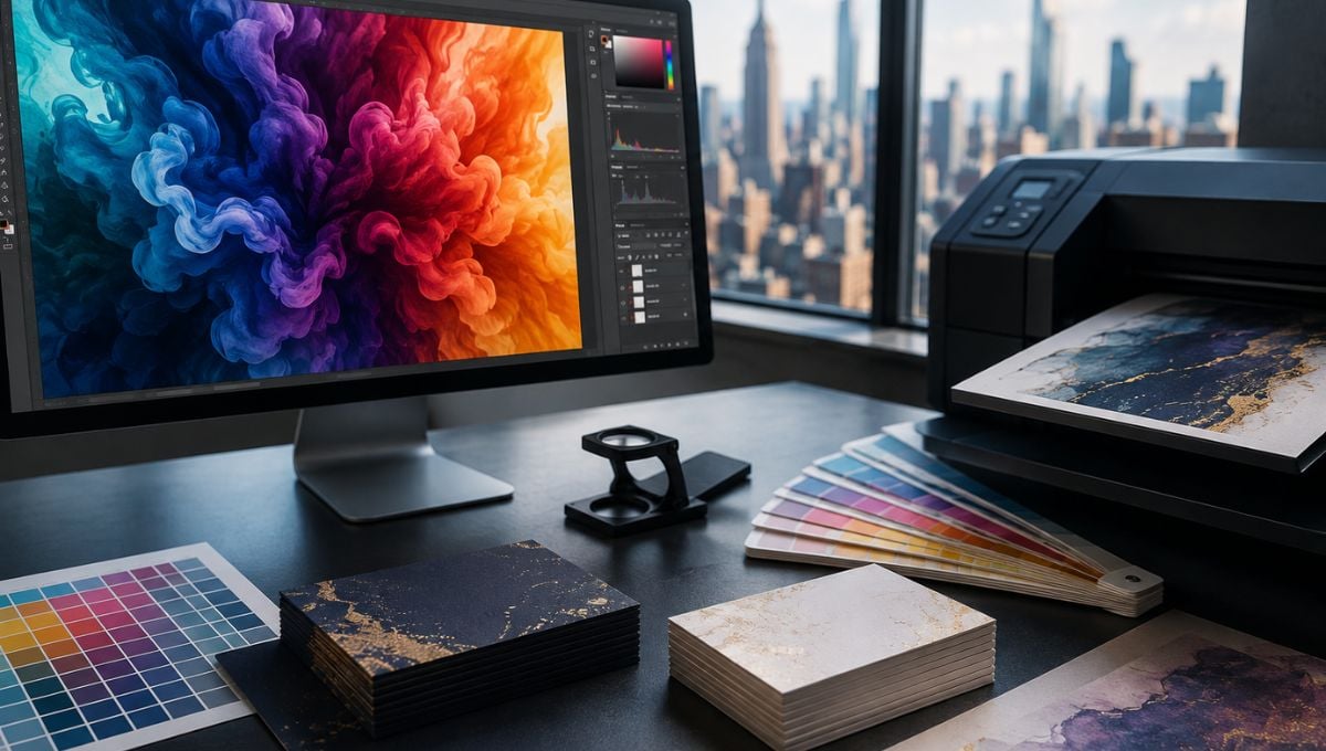
AI-generated artwork has changed the way designers create illustrations, backgrounds, textures, and visual concepts. Tools such as Adobe Firefly, Midjourney, and DALL-E can produce sophisticated imagery in seconds, but an image that looks impressive on a screen is not automatically ready for commercial printing. Print production introduces requirements that AI image generators do not necessarily account for, including resolution, color spaces, bleed, typography, transparency, and the physical limitations of a particular printing process. Adobe, for example, identifies 300 pixels per inch (ppi) as the standard resolution for high-quality prints viewed up close, while professional PDF workflows also require careful management of color, fonts, links, and bleed.
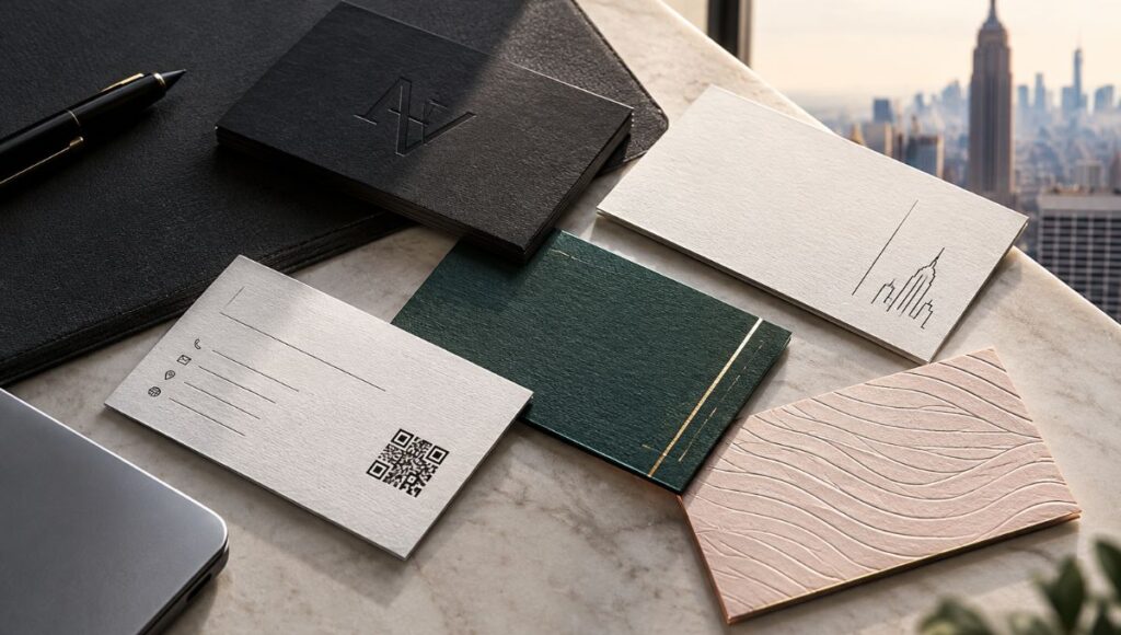
This distinction matters especially when producing premium stationery or business cards in NYC, where small details and color consistency can have a major effect on the perceived quality of the finished piece. Whether you’re preparing a creative illustration, a branded background, or artwork for luxury business cards nyc, an AI-generated image should go through a proper prepress workflow before it reaches the printer. If you need professional assistance with design, preparation, or printing, contact Japan Printing to quote your next project and explore our nyc business card services.
Low Resolution and the “It Looks Fine on My Screen” Problem
One of the biggest mistakes with AI-generated artwork is assuming that an image looks good on a monitor simply because it appears sharp at its displayed size. Digital displays and printed materials work differently. An AI image may have impressive visual detail but still contain insufficient pixel information for the physical dimensions at which it will be printed.
Adobe states that 300 ppi is considered the industry standard for high-quality print, particularly for smaller pieces viewed relatively close to the viewer. Lower resolutions can be appropriate for large-format graphics viewed from a distance, but business cards, invitations, stationery, and other small printed pieces generally demand considerably more attention to image resolution.
This becomes particularly important with AI-generated artwork because many image-generation platforms produce files that may need to be enlarged before they can fill a print layout. Simply increasing the dimensions of a low-resolution image does not recreate the original detail. When an image is resampled, software has to generate additional pixels, which cannot fully replace information that was never present in the original file.
Before sending AI artwork to a printer, check:
- The actual pixel dimensions of the generated image.
- The intended physical size of the printed artwork.
- The resulting effective PPI at that size.
- Whether important details remain sharp when viewed at 100%.
- Whether enlargement introduces softness, artifacts, or unnatural textures.
- Whether the image needs professional upscaling or partial reconstruction.
For example, an AI image that looks excellent on a website may become visibly soft when enlarged to cover an entire business-card background. This is especially problematic for luxury business cards nyc, where clean photographic textures, fine patterns, and sophisticated backgrounds are expected to look intentional rather than blurry.
Adobe’s print guidance also emphasizes that commercial-printing requirements can vary depending on the production process, so the printer’s specifications should always take priority over a generic resolution rule.
RGB Colors That Do Not Translate Correctly to Print
Another major problem is color. Most AI image generators produce artwork intended primarily for digital viewing, while commercial printing often requires a carefully managed CMYK workflow. RGB and CMYK are fundamentally different color models: RGB combines light, whereas CMYK uses combinations of printing inks.
As a result, an AI-generated image can contain extremely vibrant colors that appear spectacular on a backlit display but cannot be reproduced exactly using the selected printing process. Converting an RGB image to CMYK at the last moment can therefore produce noticeable changes in saturation, contrast, and hue.
Adobe’s current print-production guidance recommends ensuring that colors are suitable for print and specifically identifies CMYK as the preferred choice for many commercial-print workflows. Adobe also recommends checking the document with preflight before exporting a print-ready PDF.
When preparing AI artwork, look for problems such as:
- Extremely bright neon colors.
- Highly saturated blues, greens, or purples.
- Dark areas containing excessive total ink.
- Colors that shift dramatically after conversion to CMYK.
- Gradients that become visibly different after conversion.
- Brand colors that do not match established specifications.
This matters enormously for branded stationery. If an AI-generated background is combined with a company logo or brand color, the artwork should be evaluated in the same color environment as the rest of the document.
For brands ordering business cards in NYC, color consistency can be particularly important when the same identity appears across business cards, letterheads, envelopes, folders, and marketing materials. Pantone notes that physical color references and CMYK guides can help designers understand what colors are actually achievable in conventional and digital printing.
In other words, do not judge AI artwork exclusively by what you see on your monitor. Convert, proof, and evaluate it according to the intended printing process.
Missing Bleed and Unsafe Edges
AI image generators create images, not finished print layouts. That distinction is easy to overlook.
A printed piece needs additional artwork beyond the final trim edge whenever the background or other visual elements extend all the way to the edge. This additional area is called bleed. It gives the printer enough image area to accommodate minor variations during trimming without leaving unwanted white edges.
For example, if an AI-generated texture is intended to cover an entire business-card background, the texture should extend into the bleed area rather than stopping precisely at the final dimensions of the card.
Adobe’s print documentation specifically addresses bleed settings and notes that simply selecting a bleed option does not create additional artwork if the document itself has not been configured with a bleed area.
Before exporting, check:
- Document size: Is the artboard set to the correct final trim dimensions?
- Bleed: Does the artwork extend beyond the trim line according to the printer’s specification?
- Safe area: Are logos, text, and important visual elements sufficiently far from the trim edge?
- Background continuity: Does the AI-generated image actually extend into the bleed area?
- Cropping: Will trimming accidentally remove an important part of the composition?
AI-generated artwork can make this more complicated because the image may have a carefully composed subject near the edge. Extending the canvas artificially could create an obvious discontinuity.
Adobe has even introduced a Generative Extend feature specifically designed to generate artwork into a print-bleed area in Illustrator, illustrating how important this production requirement is within modern AI-assisted design workflows.
For premium stationery and nyc business card services, bleed is not a minor technical detail. It is part of making sure the final piece looks deliberately designed rather than improperly cropped.
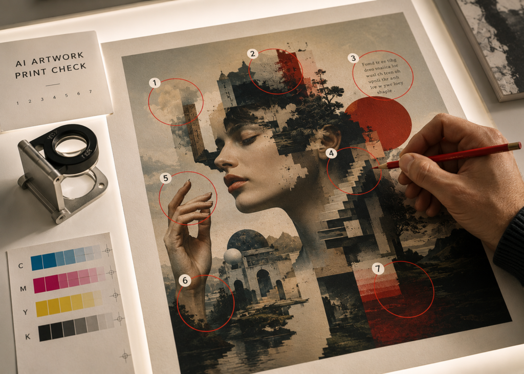
AI Artifacts, Distorted Details, and Unwanted Elements
The fourth problem is one of the most recognizable characteristics of generative AI: visual inconsistencies.
AI-generated images can contain artifacts that are difficult to notice when the artwork is viewed quickly on screen. Hands, fingers, jewelry, architectural details, repetitive patterns, reflections, small objects, and intricate textures can sometimes contain inconsistencies or unnatural structures.
This becomes especially problematic when artwork is printed large or used repeatedly across a branded system.
A designer should inspect the generated image at high magnification before incorporating it into a print layout. Look for:
- Distorted objects.
- Repeated elements that do not match.
- Strange textures.
- Unnatural shadows or reflections.
- Incorrect geometry.
- Artificial-looking edges.
- Broken patterns.
- Unwanted objects in the background.
- Strange details that become more visible after sharpening or printing.
This is particularly important for minimalist designs. A small artifact hidden inside a busy digital composition may become surprisingly obvious when the same artwork is printed on a clean, premium business card.
AI-generated text deserves special attention. If the generator creates lettering inside an image, do not assume it is accurate simply because it looks convincing at first glance. Whenever possible, recreate important text as actual editable typography in Illustrator, InDesign, Photoshop, or another appropriate design application.
Adobe’s own guidance for AI-generated illustrations emphasizes avoiding embedded text, signatures, watermarks, and model inconsistencies in submitted generative artwork.
For luxury business cards nyc, this distinction is critical. AI can be excellent for generating visual concepts, textures, or imagery, but the final production artwork should be professionally reconstructed and checked rather than treated as an untouched AI output.
AI-Generated Typography and Logo Problems
AI is increasingly capable of producing convincing lettering, but that does not mean AI-generated typography belongs in a final print file.
Typography requires exact control over spelling, spacing, alignment, hierarchy, kerning, and consistency. A single incorrect character can ruin an otherwise professional business card.
The safest approach is to use AI for the visual components and create critical typography separately using real fonts and editable text. This is particularly important for:
- Names.
- Company names.
- Addresses.
- Telephone numbers.
- Email addresses.
- Website URLs.
- Social media handles.
- Legal information.
- Product specifications.
- Brand slogans.
Logos require an even stricter workflow. A company logo should normally come from the brand’s approved vector artwork rather than an AI-generated approximation. Recreating a logo through generative AI can introduce subtle geometric differences that may become obvious when the logo is compared with official brand materials.
Font handling is also part of professional PDF production. Adobe’s current print-production guidance recommends checking that fonts are available and licensed, updating links, setting correct bleeds and margins, and running preflight before exporting a print-ready PDF.
A strong workflow is therefore:
AI artwork → professional retouching → layout → real typography → brand assets → preflight → print-ready PDF
This approach allows AI to contribute creativity without allowing its imperfections to determine the final printed product.
For businesses looking for business cards in NYC, this distinction can make the difference between a card that feels premium and one that looks like an unedited AI experiment. Professional nyc business card services can help transform an AI concept into a production-ready design with controlled typography, spacing, color, and finishing specifications.
Transparency, Gradients, and Complex Effects That Behave Differently in Print
AI-generated artwork often contains gradients, glows, shadows, translucent objects, atmospheric effects, and layered textures. These can look excellent digitally but create additional considerations during commercial production.
The issue is not necessarily that transparency or gradients cannot be printed. Modern PDF and RIP workflows can handle sophisticated effects, and Adobe recommends PDF/X-4:2008 as an optimal PDF format for reliable print publishing workflows in Illustrator.
The problem is that designers may not understand how those effects interact with the rest of the document.
For example, an AI-generated image might contain:
- Very subtle gradients.
- Transparent-looking textures.
- Soft glows.
- Semi-transparent shadows.
- Complex overlapping elements.
- Fine noise or grain.
- Extremely delicate highlights.
These effects should be checked after the artwork is placed into the final document and exported as a PDF. A design that looks correct in the original AI-generated PNG may not behave identically once it has been converted, color-managed, scaled, compressed, and combined with other artwork.
The best approach is to perform a final proof rather than assuming that the exported PDF will look identical to the original image.
It is also important to distinguish between screen appearance and printed appearance. A monitor can display subtle luminance differences that may be much less noticeable on paper. Paper stock, ink, coating, and printing technology all influence the final result.
This becomes especially relevant for premium stationery. A subtle AI-generated marble texture, metallic-looking gradient, or soft shadow may need adjustment depending on whether it will be printed digitally, offset, or combined with finishing processes such as foil stamping or specialty coatings.
For luxury business cards nyc, the goal should not simply be to reproduce the AI image. The goal should be to adapt the image so that its visual qualities survive the physical production process.
Copyright, Licensing, and Commercial-Use Questions
The final problem is not technical at all—it is legal and commercial.
Before using AI-generated artwork for a business, advertising campaign, stationery system, packaging project, or commercial print job, you should understand the terms governing the AI tool that generated the image.
Different AI platforms have different terms, licenses, restrictions, and policies. Commercial-use rights should never be assumed merely because an image was generated by an AI service.
Adobe’s current guidance for generative AI content explicitly advises users to verify that the relevant AI tool permits the intended commercial use. Adobe Stock also requires contributors to have the necessary rights to submit AI-generated content and imposes specific requirements for generative AI submissions.
There is another consideration: recognizable intellectual property.
AI-generated artwork can sometimes resemble existing creative works, brands, characters, or recognizable individuals. Using generated imagery that creates trademark, copyright, publicity-rights, or other legal concerns can introduce unnecessary risk for a commercial project.
Before approving an AI-generated image for print, ask:
- What AI tool created the artwork?
- What does its current commercial-use license allow?
- Was the artwork generated from potentially protected source material?
- Does it contain recognizable trademarks or characters?
- Does it depict an identifiable person?
- Does the artwork contain another company’s logo?
- Does the project require model or property releases?
- Are there client-specific restrictions on AI-generated content?
Adobe’s generative AI guidance also highlights requirements around intellectual property, identifiable people, and the use of artists’ names or protected creative works in certain contexts.
For a commercial print project, these questions should be resolved before hundreds or thousands of physical pieces are produced. Printing an image does not eliminate the underlying rights issues.
Conclusion
AI-generated artwork can be an extremely useful part of a modern print-design workflow, but the generated image should be treated as raw creative material rather than automatically print-ready artwork. Before sending a file to a printer, check the resolution, convert and manage colors appropriately, add sufficient bleed, inspect the artwork for AI artifacts, rebuild important typography and logos, test complex effects, and verify that the artwork can legally be used for the intended commercial purpose. Professional preflight is especially important for premium stationery, where small production errors can become highly visible.
If you’re planning business cards in NYC, premium stationery, invitations, corporate materials, or luxury business cards nyc, Japan Printing can help turn your concept into professionally prepared printed materials. Our nyc business card services are designed for projects where design quality and production accuracy need to work together. Contact Japan Printing to request a quote for your design and business card creation project and let our team help prepare your artwork for a polished final result.