Business Cards 11.09.26
Why Some Colors Are Impossible to Reproduce Exactly in CMYK

Daniel Cantor

Have you ever selected the perfect color on your computer screen, only to discover that it looks completely different when printed? This is one of the most common challenges in professional printing, particularly when working with vibrant brand colors, premium stationery, and business cards. The reason is not necessarily a mistake in the design or printing process. It comes down to the fundamental differences between how screens display colors and how printing inks reproduce them.
CMYK printing uses four inks—cyan, magenta, yellow, and black—to create a wide variety of colors, but its capabilities have physical limitations. Some shades simply fall outside the range that these four inks can produce. Understanding these limitations is essential when planning a professional print project. Whether you are developing a new brand identity or investing in business card design nyc, knowing how color reproduction works can help you make better design decisions. At Japan Printing, we help businesses create professional business cards and stationery that balance creative vision with high-quality printing results. Contact us today to request a quote for your next business card design and printing project.
Understanding the Difference Between RGB and CMYK Color Gamuts
One of the main reasons certain colors cannot be reproduced exactly in CMYK is that screens and printing presses use fundamentally different color systems. Digital displays use RGB, which stands for red, green, and blue. This is an additive color model: screens produce colors by combining different intensities of colored light. When red, green, and blue light are combined at full intensity, they create white. This system allows modern monitors and smartphones to display extremely bright and saturated colors.
Commercial printing, on the other hand, generally relies on CMYK: cyan, magenta, yellow, and black. This is a subtractive color model because inks absorb certain wavelengths of light while reflecting others toward the viewer. As more ink is combined, more light is absorbed, producing darker colors. Black ink is added to improve the reproduction of dark tones, neutral grays, and text, since combining cyan, magenta, and yellow does not produce a clean, neutral black with conventional printing inks.
The range of colors a particular system can reproduce is called its color gamut. RGB displays generally have a wider gamut than standard CMYK printing processes, although the exact range depends on the device and its specifications. Consequently, a color that looks brilliant on a computer screen may not have an equivalent in the available printing gamut.
Some common examples include:
- Electric blues: Highly saturated blues can lose their intensity when converted from RGB to CMYK.
- Neon greens: Bright, almost fluorescent greens are particularly difficult to reproduce using conventional process inks.
- Vivid oranges: Some highly saturated orange shades fall outside the range of standard CMYK printing.
- Intense purples: Certain combinations of blue and magenta cannot reproduce the same brightness and saturation seen on screen.
When an RGB color falls outside the CMYK gamut, color management software must translate it into a printable alternative. The result is usually the closest available approximation, rather than an exact reproduction of the original color.
Understanding this difference early in the design process helps prevent unrealistic expectations and reduces unexpected color changes when artwork moves from a digital environment to physical production.
Why Certain Colors Lose Their Brightness and Saturation in Print
Color reproduction is not simply a matter of combining four inks in different percentages. The physical properties of printing inks determine which wavelengths of light they absorb and reflect. Unlike the light emitted by a digital display, printed colors depend on reflected light, the characteristics of the pigments, and the interaction between different ink layers.
Standard CMYK inks have limitations in their ability to produce extremely saturated colors. For example, a monitor can display a very intense green by emitting green light directly. However, conventional cyan and yellow printing inks cannot necessarily reproduce that same visual intensity when combined on paper. The resulting green may appear less vibrant, more muted, or slightly different in hue.
This is particularly noticeable when converting artwork containing highly saturated RGB colors into a CMYK document. The conversion process does not create new printing capabilities. Instead, it maps colors outside the destination gamut to colors that the printing system can reproduce.
The same challenge affects some premium stationery and business card designs. A brand may use a distinctive electric blue, bright turquoise, or vivid orange as its primary identity color. If that shade is outside the CMYK gamut, simply adjusting the cyan, magenta, yellow, and black percentages will not guarantee an exact match.
Several factors contribute to these limitations:
- Ink pigmentation: Conventional process inks have specific absorption and reflection characteristics that restrict the colors they can produce.
- Ink combinations: Layering multiple process inks does not always create the desired hue or saturation.
- Total ink coverage: Excessive ink application can create production problems, including drying difficulties and unwanted changes in appearance.
- Color conversion: Different color profiles and conversion settings can produce different results from the same original RGB artwork.
It is important to understand that a less vibrant printed color does not automatically indicate poor printing quality. Sometimes the printing equipment is reproducing the closest possible match within the limitations of its ink system.
For designers and businesses, the best approach is to evaluate colors with the final printing process in mind. Choosing realistic color specifications from the beginning makes it easier to maintain a consistent visual identity across business cards, letterheads, envelopes, and other branded materials.
How Paper, Printing Conditions, and Color Profiles Affect the Final Result
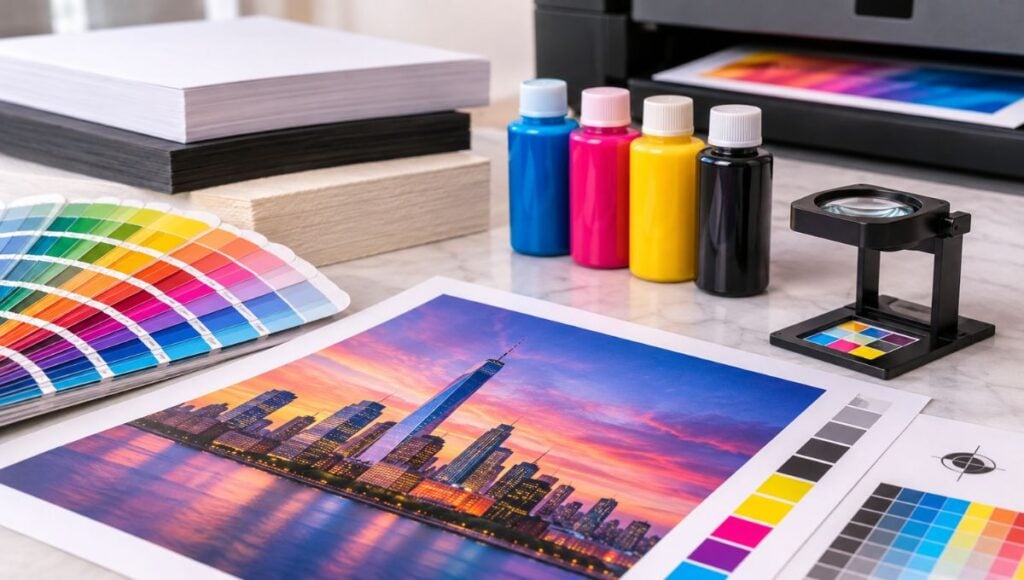
Even when a color falls within the CMYK gamut, achieving consistent results requires more than selecting the correct numerical values in a design application. The final appearance of printed ink depends on the printing equipment, the production conditions, and the surface receiving the ink. This explains why the same CMYK color values can look different when printed by different companies or on different materials.
Paper is particularly important in stationery production. Coated and uncoated stocks interact with ink differently. Coated papers generally have a more controlled surface that limits ink absorption and can help produce sharper details and more saturated colors. Uncoated papers, by contrast, tend to absorb more ink into their fibers, potentially creating a softer or less intense appearance. Their natural texture and surface characteristics also influence how people perceive the finished color.
Other production variables include:
- Printing equipment: Different digital and offset presses have different color reproduction capabilities.
- Ink characteristics: Variations in ink formulation and pigmentation can influence the final appearance.
- Paper whiteness: The base color of the paper affects the light reflected through and around the printed ink. A warmer or less bright sheet can change the perceived appearance of certain colors.
- Ink absorption: The amount of ink absorbed by the paper can affect saturation, sharpness, and tonal appearance.
- Printing calibration: Equipment maintenance and calibration help maintain consistency between production runs.
- Environmental conditions: Temperature and humidity can influence certain materials and printing processes.
Color profiles are another essential part of this process. ICC profiles describe the color characteristics of specific devices and printing conditions, allowing color management systems to translate colors more predictably between different environments. A destination profile for a particular printing process helps designers understand how their artwork is likely to appear after conversion.
Adobe recommends using color management to manage differences between devices and output conditions. Its tools also allow designers to preview how colors will appear under a selected printing profile through soft proofing.
For professional business cards, these considerations are especially relevant because the paper stock is an important part of the finished product. A color that looks excellent on a coated card may have a noticeably different appearance on an uncoated or textured stock. Therefore, selecting the right paper and evaluating a representative proof can be just as important as choosing the original color values.
How to Achieve More Accurate Colors in Professional Printing
Although standard CMYK printing cannot reproduce every visible color, there are several ways to improve color accuracy and achieve results that remain consistent with a brand’s visual identity. The most effective approach is to consider the printing requirements during the design stage instead of waiting until the artwork is ready for production.
One of the first steps is to prepare artwork using the appropriate CMYK color profile for the intended printing process. Rather than designing exclusively in RGB and converting everything at the last minute, designers should evaluate important brand colors early. This makes it easier to identify colors that may change significantly during conversion and adjust the design accordingly.
Soft proofing is another useful technique. Applications such as Adobe Photoshop and InDesign allow designers to simulate the appearance of artwork under a selected output profile. Although a monitor cannot perfectly replicate the physical printing process, a properly configured display and appropriate proofing settings provide a more realistic preview than viewing unconverted RGB artwork.
For projects where color accuracy is particularly important, there are additional options:
- Use Pantone spot colors: Pantone spot inks are premixed to specific formulations and can reproduce certain colors that standard CMYK cannot achieve. They are particularly useful for distinctive corporate colors and brand identities.
- Request a physical proof: Reviewing an actual printed sample provides a better indication of the final appearance than relying exclusively on a computer screen.
- Choose the appropriate paper stock: The finish, whiteness, and texture of the material can significantly influence the perceived color.
- Consider extended-gamut printing: Some printing systems use additional inks, such as orange, green, and violet, to reproduce a wider range of colors than conventional four-color printing.
- Maintain consistent production specifications: Using the same printing conditions, paper specifications, and color management settings helps improve consistency across multiple orders.
Pantone explains that its Extended Color Gamut approach uses additional base inks to expand the range of reproducible colors. However, spot colors and expanded-gamut systems may involve additional production requirements and costs, so the appropriate solution depends on the project.
For business cards and corporate stationery, it is worth discussing these possibilities before production begins. A carefully selected color strategy can help preserve brand recognition while ensuring that the final printed materials look professional and cohesive. The objective is not always to reproduce every digital color exactly, but to choose the most appropriate printing method to achieve the intended visual result.
Conclusion
Some colors are impossible to reproduce exactly in standard CMYK because four conventional printing inks cannot generate the entire range of colors visible on modern digital displays. Differences in color gamuts, ink properties, paper characteristics, and printing conditions all contribute to variations between what designers see on their screens and what they receive as finished products. Fortunately, understanding these limitations makes it possible to plan more effectively, select suitable paper stocks, use accurate color profiles, and consider alternatives such as Pantone spot inks when necessary.
These details are particularly important when creating professional business cards and stationery, where color consistency plays an essential role in brand recognition. At Japan Printing, we are committed to helping businesses turn their creative ideas into high-quality printed materials. Contact Japan Printing today to request a quote for your business card design and creation project, and let us help you develop stationery that represents your brand with professionalism and attention to detail.