Business Cards 02.18.25
Choosing the Right Typography for a Business Card

Daniel Cantor
The typography of a business card is a key element in its design. Text not only plays an important role in aesthetics but also influences brand perception. Choosing the right typography enhances readability, reflects corporate identity, and effectively communicates information to the recipient. By reading this article, you’ll learn how to make a lasting impression with your business card rather than having it go unnoticed.
Below, we will explain the essential factors for selecting the best typography for a business card and how to ensure it fully aligns with your brand. At Japan Printing, we are experts in business cards in NYC. Visit us and get a quote for your project!
Key Factors When Selecting Typography for a Business Card
1. Readability: A Design Priority
It’s simple—if a font is difficult to read, DON’T choose it. Readability is the most important factor when selecting typography for a business card. An illegible or overly decorative font will make it harder for clients to understand the essential information you’re providing.
Tips to Improve Readability:
- Avoid excessively ornate fonts or those with very thin strokes.
- Choose a proper contrast between text and background to prevent visibility issues.
- Use an appropriate font size. The name and job title should be larger than the contact details. (Check here how to create the ideal business card).
- Opt for fonts that maintain clarity in both print and digital formats.
According to a recent study, letter shapes and text layout affect reading ease and, more importantly, the memorability of a business card.
2. Industry and Style: Typography as a Brand Reflection
The chosen typography should help potential clients identify and associate the business card with your brand. Each industry has a distinct visual style that sets it apart from others.
Corporate Sector: Trust and Professionalism
For formal businesses such as law firms, consulting agencies, or banks, serif fonts convey authority and prestige.
Recommended Fonts:
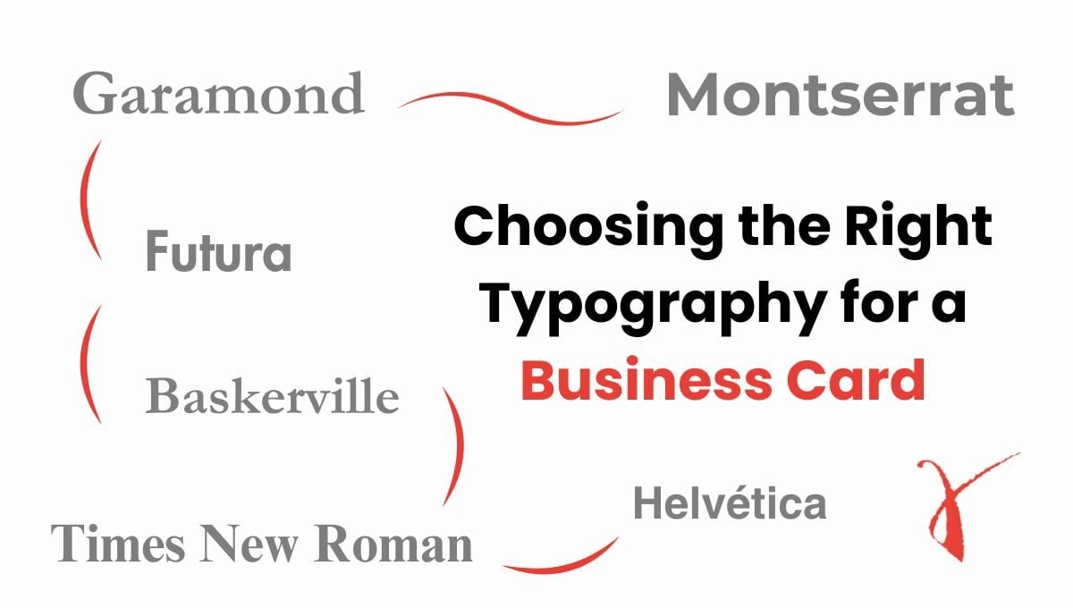
- Garamond: Elegant and sophisticated, perfect for traditional brands.
- Times New Roman: Classic and professional, widely used in corporate environments.
Technology Sector: Modernity and Innovation
Tech companies prefer sans-serif fonts for their clean and modern appearance, ideal for conveying efficiency and simplicity.
Recommended Fonts:
- Baskerville: Elegant and sophisticated, perfect for traditional brands.
- Futura: Modern and versatile, ideal for a contemporary and minimalist design.
Creative Sector: Originality and Expression
For designers, illustrators, musicians, or any creative profession, a handwritten or customized font can help stand out.
Recommended Fonts:
- Pacifico: Fluid and eye-catching, ideal for a personal touch.
- Dancing Script: Sophisticated and dynamic, perfect for impactful cards.
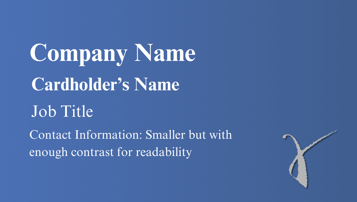
Typographic Hierarchy: Highlighting Key Information
Using different font weights, sizes, and styles helps guide the reader’s attention and emphasize the most important information.
Example of a Well-Structured Hierarchy:
- Company Name: Large size and bold.
- Cardholder’s Name: Slightly smaller but still highlighted.
- Job Title: Lighter weight or italicized to differentiate.
- Contact Information: Smaller but with enough contrast for readability.
Applying hierarchy correctly makes the card easy to read and quickly process.
Typography and Successful Combinations
To maintain a harmonious design, use a maximum of two different fonts on a business card.
Recommended Combinations:
- Serif + Sans-serif: (Example: Garamond + Montserrat) for a balance between classic and modern styles.
- Sans-serif + Sans-serif: (Example: Helvetica + Roboto) for a clean and contemporary design.
- Serif + Script: (Example: Times New Roman + Pacifico) for a design with personality.
At Japan Printing, we don’t limit the number of fonts you can use on your business card, but we recommend avoiding more than two different typefaces, as it may make the design look cluttered.
Additional Tips for a Smart Choice
1. Print Test Samples
Before finalizing the typography, print test samples on different paper qualities to ensure it looks good under all conditions. Some fonts may lose clarity when printed in small sizes.
2. Maintain Brand Consistency
The chosen typography should align with the company’s visual identity and other marketing materials, such as the website or corporate brochures.
3. Consider Spacing and Margins
Avoid overly condensed fonts or insufficient spacing, as they can make reading difficult. Leave enough space between elements for a balanced design.
4. Avoid Excessive Effects
Shadows, outlines, and low-contrast colors can affect text clarity. It’s best to opt for a minimalistic and well-structured design.

Common Mistakes When Choosing Typography for a Business Card
1. Using Unprofessional Fonts
Fonts like Comic Sans or Papyrus do not convey professionalism and can reduce brand credibility.
2. Choosing Font Sizes That Are Too Small
If the text is too small, it becomes difficult to read. Ensure that even people with weaker eyesight can read it without effort.
3. Poor Color Choices
Text should contrast with the background to ensure visibility. Avoid combinations like yellow on white or red on black.
4. Overusing Different Fonts
Mixing too many typefaces creates a chaotic and unprofessional design. It’s better to keep it simple and well-structured.
Conclusion
If you want to make a great impression with your business card, don’t just focus on graphic design, colors, or texture. Give typography the same importance—consider readability, brand alignment, and typographic hierarchy.
Remember, less is more: a clean, balanced, and well-chosen font can make your business card memorable and reflect professionalism. Trust us, and you’ll create incredible designs!
Thank you for reading! If you still need help choosing the typography for your business card, don’t hesitate to contact us. At Japan Printing, we’re here to assist you! Best regards!