Business Cards 08.10.26
Elegant Business Cards That Build Trust

Daniel Cantor
A business card may occupy only a few inches, but its role within a brand strategy is much greater. At a meeting, professional event, or business encounter, a business card can become one of the first physical points of contact between a person and a company. Research on first impressions demonstrates that judgments about other people are formed quickly in professional contexts, while studies on typography and composition show that visual decisions can influence how we perceive content and the person presenting it. Therefore, creating elegant business cards in NYC is not simply about using understated colors or thick paper: it means building a cohesive, readable piece that aligns with the brand’s positioning.
At Japan Printing, we understand that a professional business card should combine design, materials, and production to convey the quality your business represents. If you are looking to develop luxury business cards nyc or need nyc business card services to create a consistent printed identity, you can request a quote from Japan Printing for your next business card design and production project.
Elegance Begins with a Clear, Balanced, and Easy-to-Understand Design
An elegant business card does not need to fill every available inch. In fact, one of the most important resources for achieving a sophisticated appearance is knowing precisely which elements to leave out. Adobe points out that negative space helps direct attention toward important elements and that excessive visual information can create confusion. It also highlights the importance of hierarchy and organizing content so viewers can quickly understand the information.
This is especially important on a business card because its surface area is limited. The goal should not be to include absolutely every piece of company information, but rather to select the details the person receiving the card actually needs.
An elegant composition typically pays attention to elements such as:
- Name and title: these should be easy to identify at a glance.
- Logo: it should have enough space around it to breathe and should not compete with the rest of the information.
- Contact information: phone number, email, website, or relevant social networks.
- Visual hierarchy: not every element should have the same size or visual weight.
- Negative space: this helps separate groups of information and prevents the card from feeling cluttered.
- Alignment: a consistent structure creates order and a sense of professionalism.
Typography plays an especially important role. Research published in 2026 found that different typefaces can influence perceptions of trust, dominance, and readability, and that these impressions can be related to subsequent decisions. This does not mean that there is one universal font that creates trust, but rather that typographic selection should respond to the context and identity of the brand.
For luxury business cards nyc, for example, a carefully selected combination of typography, spacing, and hierarchy can communicate sophistication without relying on unnecessary decorative elements. A law firm, architecture studio, financial consultancy, and fashion brand may require completely different solutions, even if they all seek to communicate trust.
The key is for the business card to look intentional. When every element has a purpose, the final result tends to feel more refined and professional.
Paper, Thickness, and Finishes: Trust Is Also Built Through Touch
The design of a business card does not end on the screen. Once printed, the card becomes a physical object that can be seen, touched, and kept. For this reason, choosing the right paper and finishes is part of a visual identity strategy, especially when a company wants to position itself within premium markets.
Format should also be considered. In the United States and Canada, a common business card size is 3.5 × 2 inches, approximately 89 × 51 mm. Maintaining a practical format can make the card easier to store and use on a daily basis, while changes in shape or dimensions can be used when the brand identity justifies a more distinctive solution.
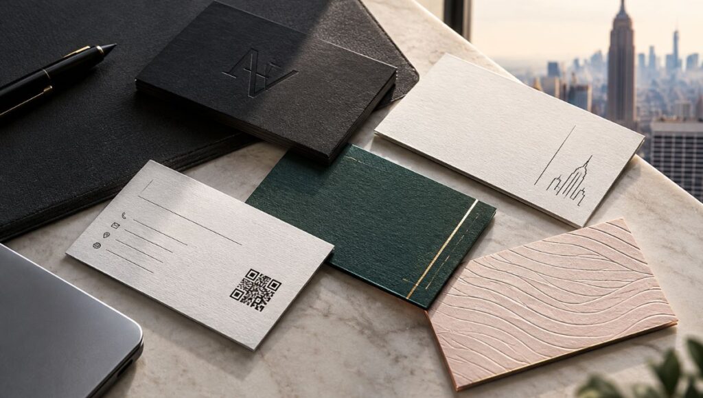
When developing an elegant business card, it is worth evaluating different variables before printing:
- Paper thickness: greater rigidity can significantly change the physical experience.
- Texture: certain papers can provide a more handcrafted or editorial feel.
- Matte finish: can support a sophisticated and contemporary aesthetic.
- Glossy finish: can add contrast and emphasize specific elements.
- Varnishes or selective effects: can be used to highlight logos or particular details.
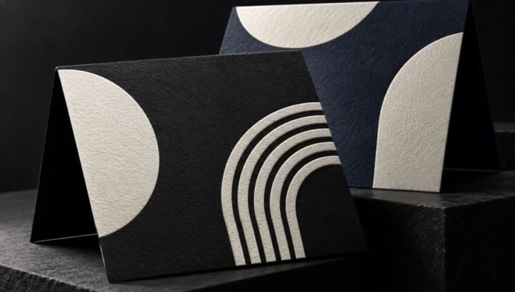
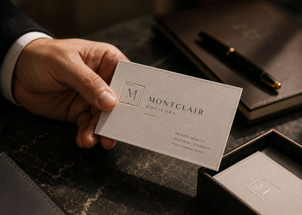
- Embossing and special techniques: can turn specific design elements into tactile points of interaction.
- Combination of materials: can be used to create a more distinctive identity.
However, “more premium” does not necessarily mean “more finishes.” A card overloaded with effects can lose precisely the sophistication it is trying to communicate. Production should remain subordinate to the concept.
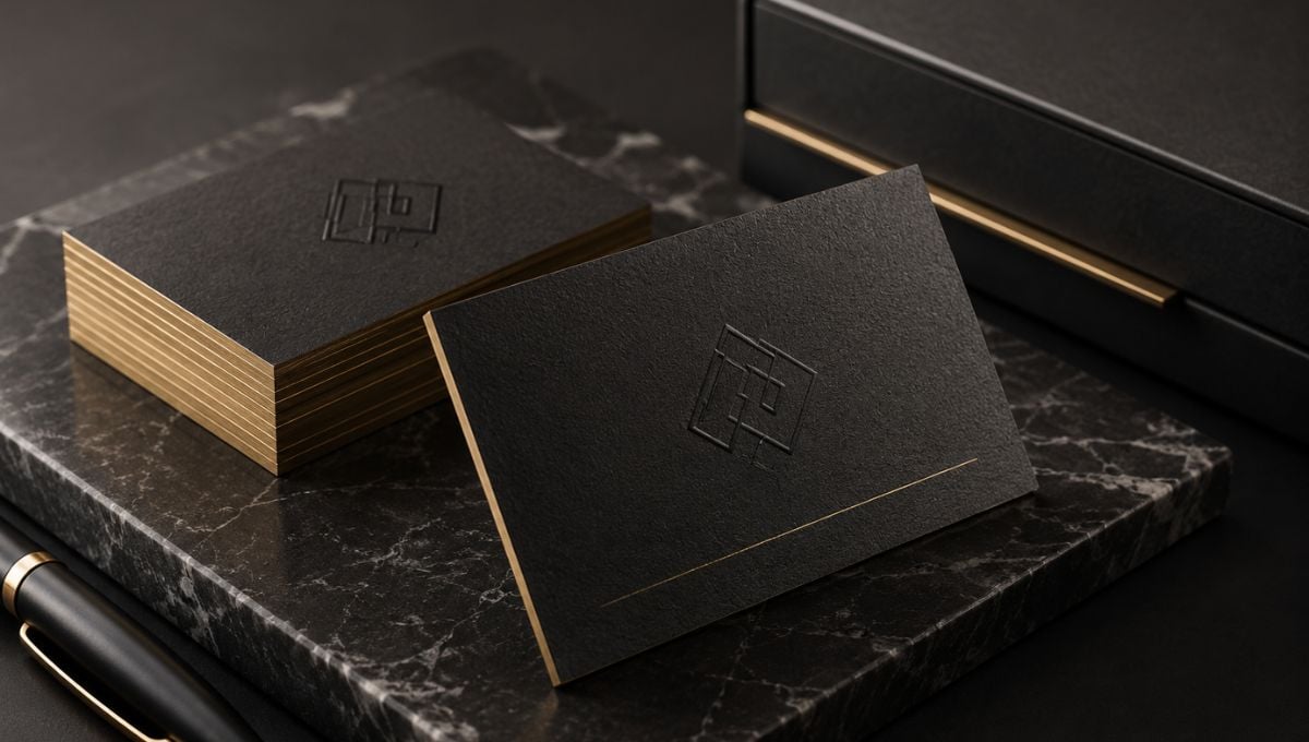
For luxury business cards nyc, for example, a minimalist approach may work better than an excessive combination of effects. A subtly highlighted logo, a high-quality surface, and a clean composition can create an experience that is more coherent with certain luxury brands.
It is also important for the selected finish to be compatible with the information. A card can be visually impressive, but if the primary contact information is difficult to read, its commercial function is weakened. With nyc business card services, where projects may be intended for very different industries, material selection should always begin with the audience, positioning, and purpose of the piece.
Trust is not created simply by making a business card feel heavy. It is created when the design, paper, and finish appear to belong to the same brand.
Colors and Typography: How to Build a Consistent Visual Personality
Color and typography are two of the most powerful resources for defining the character of a business card. Even before reading all the information, a person may perceive whether the piece feels corporate, creative, traditional, technological, minimalist, or premium. Research on typographic composition has demonstrated that different design configurations can influence readers’ judgments, while recent research on typefaces has found associations between certain typographic styles and perceptions such as trust and readability.
For this reason, choosing fonts and colors simply because they “look nice” may not be enough. Decisions should respond to the personality the brand wants to communicate.
When developing an elegant business card, it is worth reviewing:
- Brand personality: Is it traditional, modern, creative, exclusive, or approachable?
- Contrast: Can the information be read quickly?
- Hierarchy: Are the name, title, and contact details organized according to their importance?
- Consistency: Does the card match the website, logo, stationery, and other materials?
- Number of typefaces: Are there enough differences to create hierarchy without making the design appear disorganized?
- Scale: Does secondary text remain readable once the card is printed?
Adobe recommends prioritizing readability, establishing a clear hierarchy, and avoiding typographic choices that sacrifice content comprehension. It also points out that size, weight, contrast, and position can be used to establish different levels of importance.
This is especially important on a business card because the available space is limited. A highly ornamental font may work well in a logo, but it may not be appropriate for an email address or phone number that someone needs to locate within seconds.
In the case of business cards in NYC, visual identity should also consider the professional environment in which the card will circulate. New York brings together industries with very different visual languages: finance, architecture, real estate, fashion, technology, hospitality, consulting, and professional services, among others.
For this reason, a good business card does not try to look generically luxurious. It aims to look appropriate for the specific brand. One company may communicate exclusivity through a monochromatic composition; another may achieve it through editorial typography; another may use a distinctive color treatment. Visual luxury does not depend on a single formula.
When the elements are coordinated, the business card can convey a sense of control and consistency. And that consistency is precisely one of the characteristics that makes a professional identity appear more carefully developed.
Elegance Does Not Mean Sacrificing Functionality: A Business Card Should Help Continue the Relationship
A business card can be visually extraordinary and still fail if the person receiving it does not know what to do with it. The purpose of a business card is not simply to make a good impression: it should also make it easier for a professional relationship to continue after the initial encounter.
Research on networking shows that professional interactions and network building can have significant effects on opportunities and professional outcomes. A study published in 2026 found positive associations between certain forms of networking and their professional benefits, while earlier research has examined how relationships and exchanges within business networks can contribute to marketing outcomes and performance.
In this context, the business card acts as a bridge between the conversation and the next point of contact.
A practical strategy is to determine which action the business card should facilitate:
- Visit the website.
- Send an email.
- Call directly.
- View a portfolio.
- Learn about the services.
- Schedule a meeting.
- Connect through a professional platform.
- Scan a QR code leading to a specific page.
A QR code can be useful when it genuinely provides an additional action. It should not be included simply because it is a trend. Its purpose should be clear, and the destination should be relevant to the person receiving the card.
The same logic applies to the content. A business card does not need to become a mini brochure. The information should be sufficient to identify the person and enable the next step, but not so extensive that it destroys the visual hierarchy.
This is particularly relevant for nyc business card services aimed at professionals who exchange business cards during meetings, trade shows, events, conferences, or business gatherings. In these situations, the card should be easy to understand quickly and remain useful after the encounter.
It is also worth thinking about the business card as part of a larger system. If the business card design uses a visual identity that is completely different from the website, sales presentation, envelopes, or letterhead, the brand experience loses continuity.
An elegant business card, then, is not simply a beautiful card. It is a physical tool designed to connect identity, information, and action. When these three elements work together, design stops being decoration and becomes a functional piece of brand communication.
Conclusion
Elegant business cards that build trust do not depend on a single characteristic. Their impact comes from the combination of a balanced composition, readable typography, clear hierarchy, consistent colors, appropriate materials, and finishes that make sense for the brand’s positioning. Research on design and first impressions supports the importance of how people quickly interpret visual signals, while studies on networking show that professional connections continue to play an important role in business opportunities. A good business card does not need to exaggerate to stand out: it needs to communicate precisely who you are, what your company represents, and how people can find you again.
If you are developing a new professional identity, updating your stationery, or need business cards in NYC that live up to your brand, Japan Printing can help you turn the concept into a carefully designed and produced printed piece. Request a quote for your business card design and production project with Japan Printing and discover the possibilities for developing luxury business cards nyc and professional nyc business card services tailored to your business.