Stationery 08.17.26
Colors That Convey Trust

Daniel Cantor
Trust is one of the most important elements for any brand that wants to build lasting relationships with its customers. Before reading a message, analyzing a logo, or learning about a company’s services, people receive visual stimuli that influence their first impression. Among these stimuli, color plays a particularly important role. Academic research has found a consistent association between certain colors and the perception of trust, although it also shows that these relationships depend on context, color intensity, and cultural factors. In particular, several studies have found that blue is commonly associated with trust and that this relationship can influence how a brand is perceived.
For a business, this means that choosing colors should not be solely an aesthetic decision. A color palette can affect how a corporate identity, website, packaging, or professional business cards are perceived. If you are looking to create an identity that projects credibility, professionalism, and consistency, Japan Printing can help you turn that visual strategy into high-quality printed pieces. Get a quote for your business card design and production project with Japan Printing and discover how we can help you create business cards in NYC that professionally represent your brand.
Blue: One of the Colors Most Associated with Trust
When discussing colors that convey trust, blue often stands out. This is not simply a matter of popular perception: academic research has found a relationship between blue and trust. A study published in the Journal of Marketing Theory and Practice compared the effects of blue and red on perceived trust and found, across three studies, that blue increased trust more than red.
This characteristic helps explain why different professional industries use shades of blue in their visual identities. However, saying that any shade of blue automatically creates trust would be an oversimplification. Hue, brightness, saturation, and the combination with other visual elements also affect the final result. In addition, cross-cultural research indicates that color associations can vary among cultural groups, even when general patterns exist.
In stationery and business cards, blue can be used in several ways:
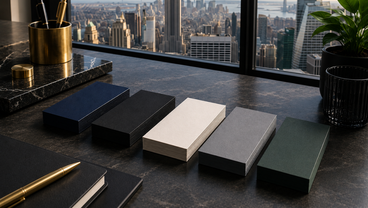
- Navy blue: communicates a more serious, stable, and sophisticated feeling, especially when combined with white.
- Medium blue: can provide a balance between professionalism and dynamism.
- Light blue: can create a more open, clean, and approachable appearance.
- Blue with white: provides classic contrast and makes information easier to read.
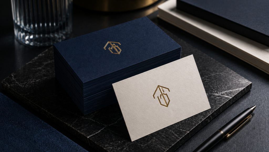
- Blue with metallic details: can elevate a card toward a more premium aesthetic.
For consulting firms, financial services, technology companies, law firms, and corporate professionals, a blue-based palette can be particularly appropriate. For luxury business cards nyc, for example, a deep blue combined with sophisticated finishes can create an identity that blends authority with exclusivity. The key is to ensure that the color is consistent with the personality of the brand rather than simply choosing it because “blue conveys trust.”
Black, White, and Gray: Building Trust Through Simplicity and Sophistication
Neutral colors can be particularly effective when a brand wants to communicate professionalism without relying on a bold or colorful palette. Black, white, and different shades of gray can be used to create minimalist visual identities in which typography, composition, paper, and printing finishes take center stage.
Black can be used to create a sense of authority, exclusivity, and sophistication, while white is often visually associated with cleanliness, simplicity, and clarity. Gray, meanwhile, can serve as a middle ground when a serious appearance is desired without the stronger impact of black. These interpretations should be understood as design associations rather than universal rules: color perception changes depending on context, color combinations, and culture.
On a business card, neutral colors allow for a wide variety of compositions:
- Black on white: classic, clean, and professional.
- White on black: more dramatic and sophisticated.
- Dark gray with white: discreet and corporate.
- Black with gold: frequently associated with a premium aesthetic.
- White, cream, and natural tones: suitable for a more elegant and warmer identity.
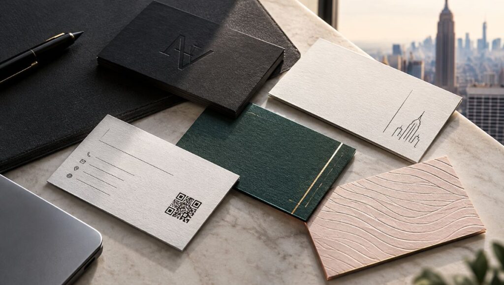
This approach is particularly interesting for brands looking for luxury business cards nyc, because the design can rely not only on color but also on materiality. High-quality paper, precise printing, carefully selected typography, and specialty finishes can work together to reinforce the perception of value.
Rather than filling a business card with numerous colors, a limited palette can give each element greater presence. For certain brands, this simplicity can be much more effective than a visually saturated design.
Green, Red, and Other Colors: Trust Also Depends on Context
Although blue frequently appears in research on trust, it does not mean it is the only valid option. Green, red, yellow, and other colors can perform different functions within a visual identity. In fact, studies on color associations show that color can be connected with different emotions and concepts depending on the hue and cultural context. In a cross-cultural study involving 1,218 participants from four cultural groups, blue stood out for its association with trust, while red showed a stronger association with emotion.
Red, for example, can add energy, intensity, and dynamism. This can be appropriate for a brand that wants to project action or personality, but using large amounts of red does not necessarily communicate the same sense of stability as a blue-based palette. A study on color and trust also found that red generated less trust than blue under the conditions examined.
Green can be useful for brands associated with nature, sustainability, wellness, or growth. However, once again, the specific shade matters: a dark green can create an entirely different impression from a bright green.
When developing a palette for stationery, it is useful to ask:
- What personality should the brand communicate?
- Who will receive the card or printed piece?
- What industry does the company operate in?
- Does the chosen color work well with the logo?
- Does the combination maintain sufficient contrast and legibility?
- Does the palette work both on screen and in print?
The last point is particularly important. A color that looks attractive on a monitor may reproduce differently when printed. That is why designing high-quality nyc business card services requires considering the production process from the earliest stages of design, rather than only after the file has been completed.
How to Turn a Trust-Building Color Palette into an Effective Business Card
Choosing a color associated with trust is only the first step. A professional business card does not create a strong impression based on its color palette alone; typography, visual hierarchy, spacing, composition, paper, and printing quality also contribute to the final result. Research on color itself warns that color associations do not operate in isolation and that factors such as hue, brightness, and saturation can modify perception.
For this reason, an effective strategy is to build a coherent visual system. For example, a professional firm might use navy blue as its primary color, white as a background, and a small metallic accent to highlight specific elements. Another company might use black and white to develop a more minimalist aesthetic. There is no universal combination that works for every brand.
When designing a business card, several elements should be reviewed:
- Hierarchy: the name, title, and contact information should be easy to find.
- Contrast: text needs to be clearly distinguishable from the background.
- Number of colors: a limited palette can help maintain visual consistency.
- Typography: it should complement the brand’s character while maintaining good readability.
- Material: the paper affects the appearance and feel of the colors.
- Finishes: foil, embossing, letterpress, and other treatments can change how the piece is perceived.
- Consistency: the card’s colors should be part of the same visual language used across the company’s other materials.
For a premium brand, this integration is especially important. A luxury business cards nyc project can combine a sophisticated color palette with materials and finishes that make the company’s identity tangible. Likewise, professional nyc business card services can help adapt the design to the specific production requirements and printing method selected.
Research also suggests that color psychology should not be interpreted as a mathematical formula. Color can influence perceptions, but it cannot replace a complete branding strategy. Trust is built through a combination of signals: a consistent identity, clear communication, customer experience, and professional presentation. Color should reinforce these elements rather than attempting to do all the work on its own.
Conclusion
Colors can play an important role in how a brand is perceived. Blue has particularly interesting evidence supporting its association with trust, while other colors can communicate energy, sophistication, growth, approachability, or other characteristics depending on the context. Research also makes it clear that there are no completely universal meanings: associations can change depending on culture, hue, and color combinations. Therefore, choosing colors for a corporate identity should be a strategic decision rather than simply a matter of personal taste.
If you want to bring that strategy into a physical piece that your customers can keep and remember, Japan Printing can help you design and create business cards in NYC tailored to your company’s identity. From minimalist concepts to luxury business cards nyc projects, our goal is to transform your visual identity into professional stationery through thoughtful design and high-quality production. Get a quote today for your business card design, printing, and production projects with Japan Printing and explore our nyc business card services to give your brand a presentation that inspires trust from the very first interaction.