Stationery 06.25.26
How Brands Are Using Tone-on-Tone Finishes for a Modern, Quiet Look

Daniel Cantor
In recent years, visual identity design has evolved toward a far more refined aesthetic. While for decades the goal was to capture attention through bold colors, high contrast, and eye-catching finishes, many premium brands today seek to communicate exclusivity through subtlety. This is precisely where tone-on-tone finishes have become increasingly prominent in the design and printing of corporate stationery.
This trend involves combining graphic elements using the same color—or very similar shades—allowing differences to be perceived through texture, gloss, embossing, or the materials themselves rather than through color contrast. The result is an elegant piece that conveys quality without relying on exaggerated visual effects.
For businesses looking to project a sophisticated image, especially through business cards, presentation folders, and other stationery materials, this technique offers an excellent solution. At Japan Printing, we regularly work with clients seeking premium finishes that elevate their brand identity through high-quality printing solutions. If you’re looking for business cards in NYC with a modern and exclusive appearance, we invite you to request a quote and discover how we can help bring your vision to life.
What Does a Tone-on-Tone Finish Really Mean, and Why Is It Trending?
The term tone-on-tone refers to the use of a single color—or very subtle variations of the same shade—to create an entire visual composition. Instead of relying on color contrast, the design uses differences in finishing techniques to create depth, hierarchy, and visual interest.
In professional printing, this is commonly achieved through techniques such as:
- Spot UV coating over a matte background.
- Blind embossing or debossing.
- Foil stamping in a color that closely matches the paper.
- Specialty inks with subtle variations in gloss.
- Monochromatic printing on colored paper.
The growing popularity of this trend is closely tied to the rise of contemporary minimalist design. Many luxury brands have demonstrated that a visual identity can communicate prestige using fewer design elements—as long as the materials and finishing techniques are executed flawlessly.
From a psychological perspective, a quiet design creates curiosity. Instead of revealing everything immediately, it encourages the viewer to move closer, touch the surface, and discover the details through physical interaction. This experience is particularly valuable in printed products, where tactile perception remains one of the strongest advantages over digital media.
For companies offering premium services, this strategy also communicates confidence and sophistication. A brand that doesn’t rely on excessive visual effects often appears more established, trustworthy, and refined.
It’s no coincidence that many studios specializing in luxury business cards NYC have embraced this approach for law firms, architecture studios, luxury real estate developers, financial consulting firms, and high-end brands. Likewise, many providers of NYC business card services have expanded their finishing options to meet the growing demand for this elegant and understated style.
The Role of Texture and Finishes in Creating a Premium Experience
When color contrast is removed, materials become the true focal point. In a tone-on-tone design, users experience quality primarily through touch and the way light interacts with the printed piece.
For this reason, paper selection becomes absolutely critical. Even the most beautiful design can lose its impact if it’s printed on a low-quality substrate.
Among the most popular premium finishes are:
- Heavyweight cotton papers.
- Uncoated papers with natural textures.
- Thick multilayer cardstock.
- Soft-touch laminations.
- Matte coatings combined with glossy details.
- Blind embossing without ink.
- Custom embossing patterns.
- Premium laminates.
Each of these finishing techniques changes the visual perception of the piece, even when every design element shares the same color.
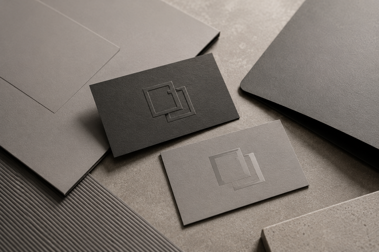
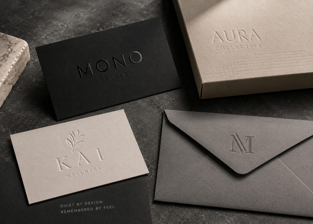
For example, a logo embossed on black paper creates a refined presence without requiring metallic inks or additional colors. Likewise, a glossy spot UV finish applied over a completely matte surface produces an effect that’s only visible when light reflects off the printed piece.
These finishing combinations transform every business card into an object that invites interaction. That tactile experience often remains in a client’s memory far longer than a conventional printed card.
This is precisely why companies seeking luxury business cards NYC often prioritize paper quality and printing craftsmanship over excessive graphic elements. The best providers of NYC business card services understand that true luxury depends not only on design, but also on the technical precision behind every finishing detail.
Which Types of Businesses Benefit Most from the Tone-on-Tone Style?
Although virtually any organization can benefit from this design approach, certain industries find the understated visual language especially effective.
These include:
- Law firms.
- Financial consulting firms.
- Architecture studios.
- Luxury real estate companies.
- Private medical clinics.
- Premium cosmetics brands.
- Boutique hotels.
- Fine dining restaurants.
- Interior design firms.
- Technology companies serving corporate clients.
These businesses typically sell trust, exclusivity, and professionalism more than mass-market consumer products. As a result, a restrained visual identity often reinforces their brand values more effectively.
The tone-on-tone approach also works exceptionally well for companies with strong, easily recognizable logos. In these cases, multiple colors aren’t necessary to create lasting brand recognition.
Business cards are one of the print materials where this technique reaches its full potential. Elegant embossing, carefully selected textures, and clean layouts immediately communicate quality and attention to detail.
This explains why many clients looking for luxury business cards NYC request minimalist finishes rather than heavily decorated designs. Similarly, many agencies specializing in NYC business card services recommend reducing unnecessary graphic elements and focusing visual impact on the physical characteristics of the printed piece.
The key is understanding that contemporary luxury is more closely associated with perceived quality than with an abundance of decorative effects.
Best Practices for Designing Business Cards with Tone-on-Tone Finishes
Successfully implementing this trend requires careful planning from the very beginning of the design process. Since the final result depends on subtle differences in texture and gloss, even small mistakes can significantly affect the finished product.
Some important recommendations include:
- Design with the printing finishes in mind from the start.
- Use clean, highly legible typography.
- Avoid overly complex layouts.
- Leave generous amounts of white space.
- Choose papers that are compatible with the selected finishing techniques.
- Produce physical proofs before final production.
- Work closely with your printing company throughout the entire process.
It’s also important to understand that a digital file cannot accurately represent the final printed result. Many of the subtle differences between finishes only become visible when the physical piece interacts with light and touch.
Another essential consideration is balancing aesthetics with functionality. Even in a minimalist design, contact information must remain easy to read.
For high-end projects, designers and printers typically collaborate closely to fine-tune embossing, coatings, die cuts, and paper selection before production begins. This partnership produces more consistent results while maximizing the visual and tactile impact of every printed piece.
That’s why businesses searching for luxury business cards NYC often value providers with expertise in both design and specialized print production. The best NYC business card services don’t simply print cards—they provide expert guidance on materials, finishing techniques, and production methods to ensure every company’s visual identity is translated flawlessly into print.
Conclusion
Tone-on-tone finishes represent one of the most compelling trends in premium design and printing today. Their growing popularity demonstrates that in a marketplace saturated with visual stimulation, true elegance often lies in subtlety. By combining premium papers, embossing, selective coatings, and minimalist layouts, brands communicate exclusivity without relying on bold colors or excessive visual effects.
For businesses looking to strengthen their corporate image through premium printed materials, this approach offers an outstanding opportunity to stand out while leaving a lasting impression on clients and business partners. Whether you need business cards in NYC, corporate stationery, or specialized printing solutions, Japan Printing has the expertise to transform your brand identity into memorable printed pieces. Contact us today for a personalized quote and discover how our design and printing services can help you create business cards with truly premium finishes.