Business Cards 02.03.25
How to Design the Perfect Business Card: Business Cards in NYC

Daniel Cantor

Did you know that business cards are often the first point of contact between your business and potential clients? This means that many visitors to your store first got to know it through this small but important item. This is where something very important and essential comes into play to determine the success of a business card: its design.
Yes, as human beings, we know very well that everything (or almost everything) is perceived visually, and if you want to do a good job of branding and marketing for your company, you must take care of every aesthetic detail of this tool.
Put yourself in the shoes of a client who receives your business card. If its design is unattractive or careless, would you trust that company’s services? You’d probably think twice.
That’s why we invite you to keep reading this article and learn how to design the perfect business card to impress your potential clients and anyone who sees its design. Don’t forget that we are #1 in Business Cards in NYC, so if you want us to make your dream business card come true, contact us and get a quote here.
Choosing Colors, Typography, and Finishes for a Perfect Branding Business Card
Attracting people and potential clients with your business card’s design is ideal, but is that all that matters, or is the real goal to turn them into actual clients? Of course, that’s the main goal. To achieve this, you must focus on a target audience, and you won’t succeed with a business card that doesn’t reflect your brand.
This is where key details such as colors, typography, finishes, visual style, texture, and shape come into play. All of these elements are crucial for your business card to faithfully represent your company’s identity.
How to Choose Your Business Card Features?
Choosing Colors
Ideally, the colors should not only match your company’s branding but also reflect what your business aims to communicate.
Example: If you own a plant business, it’s likely that your logo and other branding elements are dominated by green tones. In this case, your business card should reflect these same colors to maintain consistency and reinforce your business’s visual identity.
Here are some colors with their meanings in branding:
- White: Ideal for sophisticated and modern brands. Represents simplicity, professionalism, and minimalism.
- Black: Ideal for tech, fashion, or luxury brands. Represents exclusivity and elegance.
- Yellow: Suitable for marketing, entrepreneurial, or creative products. Represents enthusiasm or energy.
- Blue: Ideal for financial, consulting, or tech companies. Inspires credibility, trust, and professionalism.
- Red: Commonly used in cosmetics, perfumes, or entertainment brands. Represents passion, energy, or action.
- Green: As mentioned, this color is great for environmental, ecological, or health and wellness brands. Represents sustainability, nature, and growth.
- Other neutral colors: Ideal for sophisticated brands, reflecting elegance and professionalism.
Location of Colors on the Business Card
Colors shouldn’t just cover the height and width of the business card. They should make sense and be strategically placed to create the best impression.
Background
Regardless of the main color(s) of your brand, if it’s a vivid or strong tone, it’s ideal to add a more neutral color as the background of the business card:
Example: An eco-friendly brand with a bright green tone could have a white background, leaving the primary color for the logo.
This chart displays the ideal color combinations for a branding business card:

To summarize, most logo colors pair well with neutral colors like white, black, dark gray, or light gray. In the last row, you can see the best color options if you prefer to avoid any neutral colors.
Logo Placement and Design
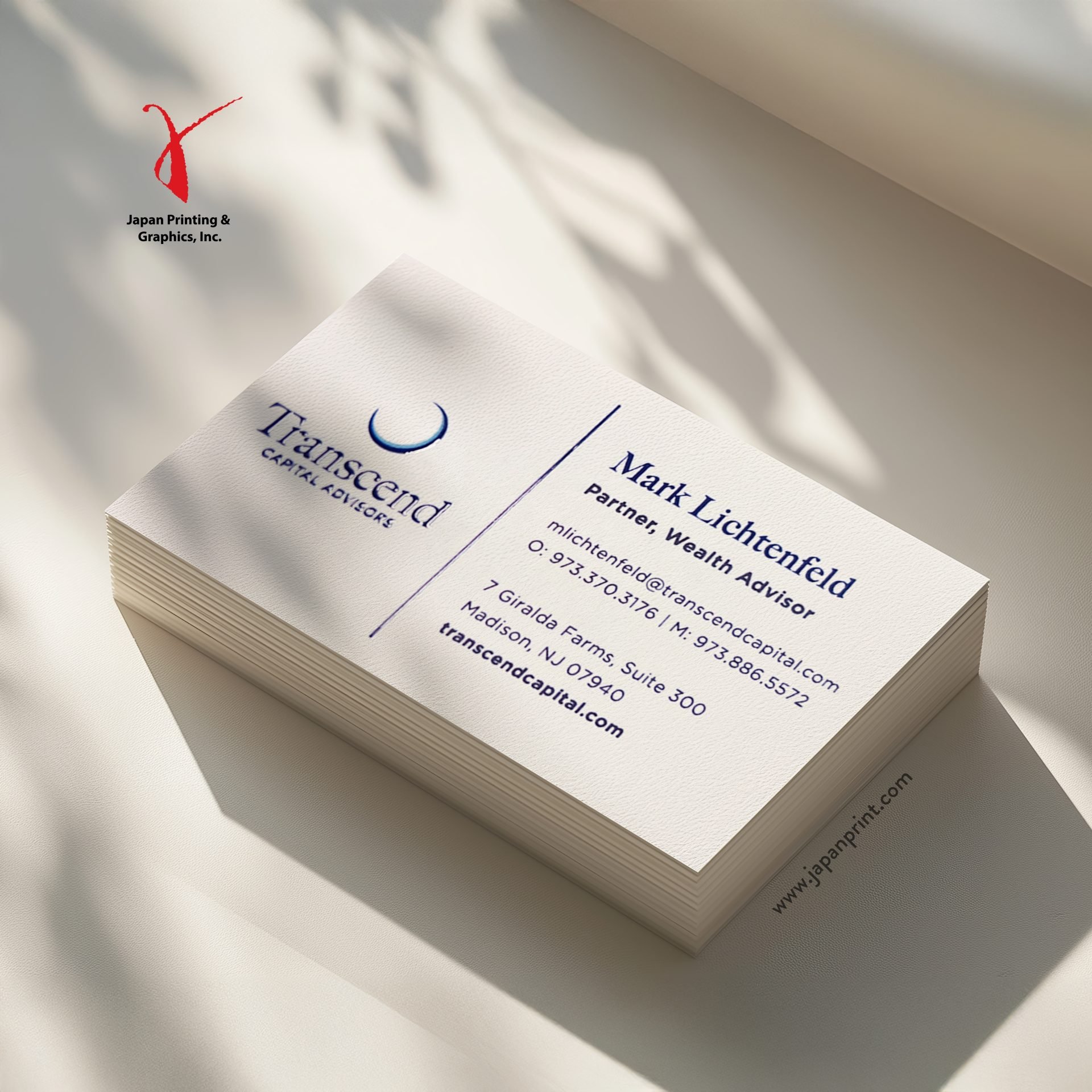
Keep this in mind: it’s not a business card if it doesn’t feature your logo. That’s why it’s also important for your logo to stand out and occupy a sufficient size without exceeding half of the card’s total size.
Additionally, the logo should have a strong contrast with the background color you chose, just as we mentioned earlier. If you choose a neutral color for the background and your logo has a different color, you can use a neutral version of it without any problem:
- Black background (white logo)
- White background (black or dark gray logo)
Finally, consider the logo’s location. We recommend placing the logo on the top left or centered on the front side of the card, as this is typically the first area the eye sees. On the back side, the logo can be placed in the bottom right corner.
Typography and Text on Your Business Card
For the font, we recommend clean, professional, and easily readable options. Some ideal font choices are:
- Montserrat
- Poppins
- Helvetica
- Times New Roman
The text color should also contrast with the background color of the card:
- If the background is black, use white text.
- If the background is white, use the colors that represent your brand but ensure good contrast.
Text size should vary depending on the type of text:
- Company name: Larger text size (12-18 pt)
- Contact details: Phone number, email, website, etc. (8-10 pt)
- Call to action: Optional text (10-14 pt)
As you know, both sides of the business card are often used, so the text should be divided as follows:
Front of the Card:
- Company name
- Slogan
Back of the Card:
- Agent’s name (if applicable)
- Agent’s position (if applicable)
- Contact phone number
- Company address
- Company social media
- Company website
What Finishes Should Your Business Card Have?
The finishes on your business card are another important part of its design. It’s possible that your company’s business cards won’t need any finishes, or they might require special finishes depending on your brand’s identity. To be more precise, we recommend the following:
Some Differences Between Finishes and Brands That Should Have Them
Your business card should have these finishes:
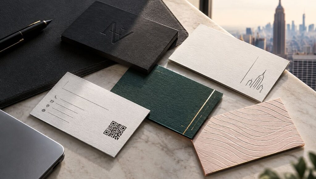
- Embossing, thick paper, or UV coating: If you want to convey elegance or exclusivity.
- Textures or metallic finishes: If you want to reflect creativity or innovation.
- Matte finish, silver or gold foil: If you want to convey luxury and sophistication.
- Recycled or biodegradable paper: If your brand is eco-friendly or nature-focused.
- Painted edges: If you have a startup or a creative brand.
Your business card should avoid finishes if:
- You’re aiming for minimalism: A clean design without textures works best.
- You want a youthful or casual impression: Simple materials and vibrant colors are better.
The Importance of a Clean and Professional Design on a Business Card
Many factors on a business card can determine the success or failure of your networking. Consider each one to make sure your card design boosts your success.
What are these factors? Here’s a list:
- First impression: A well-designed business card, with your brand identity clearly reflected and a properly organized structure, will leave a good impression on potential clients. If your card is poorly designed, it can, on the contrary, create a bad impression and be discarded quickly.
- Retention of information: Your potential client will be able to read and easily retain the information from your business card if it has a clean and well-structured design.
- Originality: Rest assured that your potential clients have seen hundreds of business cards. You can show them your card’s originality if you manage the design and creation effectively.
- Brand consistency: A business card can either reflect your brand’s identity faithfully or stray from it. Depending on the impression the client gets, they may be drawn closer or further away from your company.
A good business card design is a great investment in your own brand. Don’t be afraid to spend hours or days designing your business card or leave it to the professionals. At Japan Printing, we are #1 in creating and designing business cards in NYC, so feel free to get a perfectly designed card with us by clicking here.
Final Recommendations
- Don’t add too many elements. Don’t overload the design of your card, and you’ll see that the elements you include will stand out much more.
- Add a QR Code: While not necessary, if you want potential clients to access more information about your brand immediately, such as services or direct contact (Whatsapp, etc.), you can include a QR code in a prominent place on the back of the business card.
Remember what we mentioned at the beginning: business cards are often the first contact between you and potential clients. Make sure that first contact turns into a great first impression with a well-designed business card.