Stationery 07.22.26
How to Prevent Your Designs from Looking “Pixelated” When Printed: Essential Rules

Daniel Cantor

One of the most frustrating problems when taking a design from the monitor to paper is discovering that an image that looked perfectly sharp on screen ends up printed with blurry edges, poorly defined details, or a clearly “pixelated” appearance. This issue is especially important in professional printing projects, where visual quality directly communicates a brand’s level of professionalism. In products such as business cards, invitations, corporate stationery, brochures, and other stationery products, even small defects can affect the final perception of the work.
Pixelation is often related to image resolution, the size at which images are used, the difference between raster and vector graphics, or incorrect preparation of the final file. However, there is no single setting that guarantees that every file will print perfectly: the result depends on the type of image, the final size, the printing process, and the viewing distance. Adobe indicates that 300 pixels per inch (PPI) is a common standard for high-quality printing, especially for small pieces that are viewed up close.
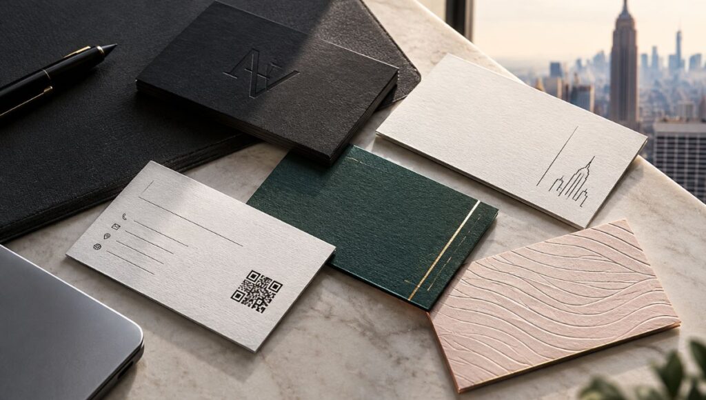
For those looking for professional results in business cards in NYC, understanding these differences is essential. In luxury business cards nyc projects, for example, the sharpness of photographs, logos, and small graphic elements can make an important difference in the final result.
In this guide, we will explain the essential rules for properly preparing files and reducing the risk of pixelation. If you are developing a corporate stationery project, business cards, or a complete stationery collection, you can contact Japan Printing for a quote on your design and business cards in NYC projects, with solutions adapted to the visual and technical requirements of each piece.
Understand the Difference Between PPI, DPI, and Resolution
One of the first rules for preventing pixelated designs is understanding what resolution actually means. In the printing world, terms such as PPI and DPI are often used interchangeably, although technically they refer to different concepts.
PPI (pixels per inch) describes the number of pixels contained in a digital image per inch when it is represented at a specific physical size. This is particularly relevant for photographs and other raster graphics. DPI (dots per inch), on the other hand, relates to the number of physical dots that a printing device can produce. Adobe explains that a resolution of 300 PPI is considered a standard for achieving high-quality prints, particularly for small pieces that are viewed up close.
This means that an image must have enough pixels to cover the size at which it will be printed. For example, if a photograph has too few pixels and is enlarged too much, those pixels must be distributed over a larger surface, and the image may lose definition.
As a practical rule:
- Always check the pixel dimensions of the original image.
- Consider the final physical size before enlarging a photograph.
- Use around 300 PPI as a reference for high-quality small-format printing.
- Do not confuse file resolution with the maximum physical resolution of a printer.
- Remember that a low-resolution image does not automatically become a high-quality image simply by changing the PPI number in Photoshop.
- Consider viewing distance: a large piece viewed from a distance can tolerate a lower resolution than a business card held only a few centimeters from the eyes.
In business cards in NYC, where designs often include photographs, textures, or detailed visual elements in relatively small formats, working with appropriate image files is particularly important. The same applies to luxury business cards nyc projects, where poor printing quality can be much more noticeable because of the attention given to fine details.
The key is to always think about the combination of available pixels + final print size + viewing distance, rather than relying solely on a resolution number.
Use Vector Graphics Whenever Possible
The second essential rule is to use vector graphics for all elements that can be constructed using mathematical shapes, lines, and paths. Unlike a raster image, which is made up of pixels, a vector graphic is defined by mathematical information that allows it to be resized without experiencing the same loss of sharpness associated with enlarging a raster image.
This makes vectors especially useful for elements such as:
- Logos.
- Icons.
- Geometric illustrations.
- Lines and shapes.
- Certain types of patterns.
- Typographic elements.
- Corporate graphics.
- Symbols and visual identity assets.
In a business cards in NYC project, for example, a company’s logo should preferably remain a vector element whenever the original file is available in that format. This allows it to be used on a small business card and later adapted to other printed materials without relying on a low-resolution raster image.
However, it is important to clarify that not every element in a document is vector-based. Photographs, for example, are normally raster images and require an appropriate resolution for their final size. Additionally, certain effects applied to vector objects can be converted into rasterized content. Adobe Illustrator allows users to set the resolution of raster effects within a document and recommends using the high-resolution setting for work intended for print; Adobe indicates that this setting uses 300 PPI for raster effects.
Therefore, when preparing designs for luxury business cards nyc, it is not enough to place a vector logo and assume that the entire document will have vector quality. You also need to review photographs, transparencies, shadows, and other effects.
A good practice is to maintain:
Vector logo + vector text + vector shapes + high-resolution photographs + properly configured raster effects.
This combination helps create stronger files for professional printing and significantly reduces the chances of important elements appearing blurry or pixelated.
Do Not Enlarge Small Images and Check Their Effective Resolution
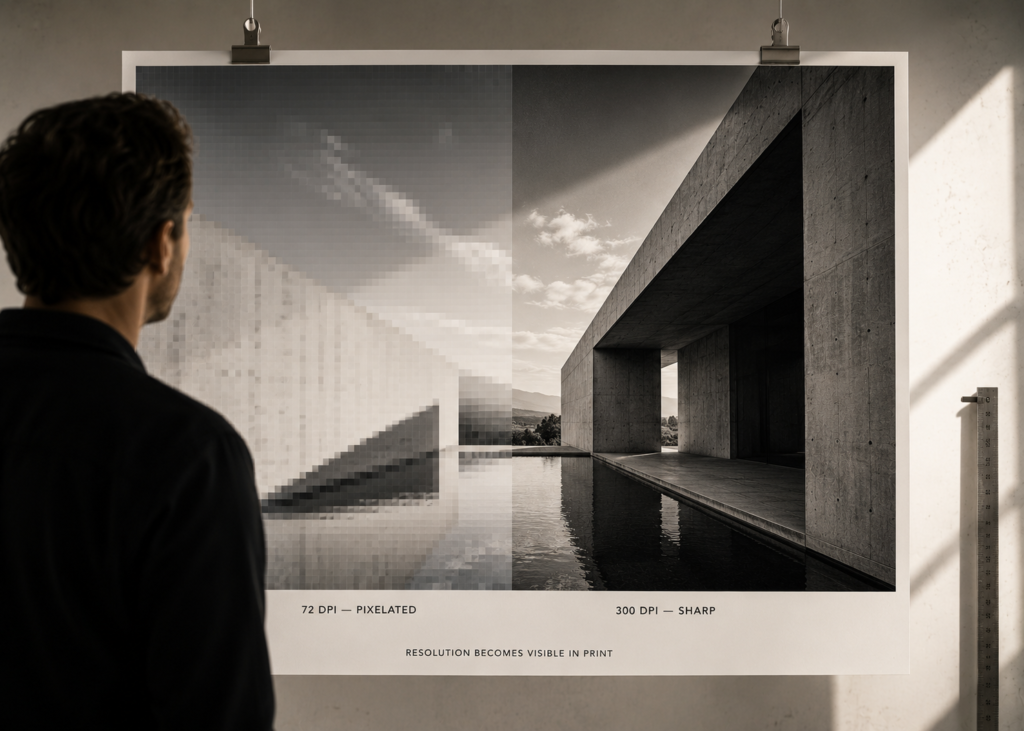
One of the most common mistakes in graphic design is downloading an image from the internet, placing it in a document, and enlarging it until it occupies a much larger space than its original resolution allows. On screen, the result may appear acceptable depending on the zoom level, but when printed, the loss of detail can become obvious.
The resolution of an image should always be analyzed in relation to its final reproduction size. A photograph that works correctly in a small space may lose quality if it is enlarged significantly. Adobe also notes that a lower resolution may be sufficient for large-format pieces intended to be viewed from a considerable distance, precisely because the perception of detail depends on viewing distance.
To avoid problems, before sending a file to production, it is advisable to review:
- The original dimensions of each image. Check how many pixels it actually contains.
- The size at which it appears in the design. An image may have an adequate resolution when used at a small size but lose quality when enlarged.
- The quality of the original source. Avoid using screenshots, thumbnails, or images downloaded from compressed versions.
- The effective resolution. It is not enough to look only at the PPI metadata; you must consider how many actual pixels exist and at what size they will be reproduced.
- The level of compression. A highly compressed image may contain artifacts even before it reaches the printing stage.
- The possibility of using the original file. If a higher-resolution photograph exists, it is preferable to work with it from the beginning.
This point is especially relevant for nyc business card services that work with customized designs. If a client provides a low-quality logo or photograph, the problem cannot always be solved by artificially increasing the resolution.
In luxury business cards nyc projects, premium surfaces, finishes, and materials can also make certain details more noticeable. For this reason, properly preparing images before the printing stage is an essential part of the process.
The best strategy is not to try to “fix” an image after it has already been enlarged too much, but rather to start with the highest-quality file available and define the final physical reproduction size from the beginning.
Properly Prepare and Review the PDF Before Printing
Even when images have an appropriate resolution, a file can still present problems if it is not properly reviewed before being sent to production. For this reason, final document preparation and the preflight process are essential steps in any professional printing workflow.
Adobe InDesign includes a Preflight tool that can detect various potential problems within a document, including low-resolution images, missing fonts, modified links, and other production errors. This makes it possible to identify problems before exporting the final file.
Adobe also recommends reviewing links, verifying that fonts are available, correctly configuring bleeds and margins, using appropriate color settings for printing, and checking that there are no critical errors before producing a print-ready PDF.
Before sending your file, a checklist may include:
- Review the effective resolution of images.
- Confirm that logos and graphics are in vector format whenever possible.
- Check that there are no missing or outdated links.
- Verify fonts and text.
- Review bleeds and margins according to the project’s specifications.
- Confirm the color space requested by the printing process.
- Run a Preflight check.
- Export using an appropriate production setting.
- Open the final PDF and visually inspect every page.
- Pay particular attention to small text, thin lines, and graphic details.
For business cards in NYC, this review is particularly important because business cards often contain small typography, contact information, and elements that require precision. In nyc business card services, a technically well-prepared file helps reduce problems during production.
It is also important to remember that proper file preparation is not simply about increasing resolution. Final quality depends on the entire workflow: original images, scale, vector graphics, raster effects, document settings, export, and printing process. A properly reviewed file makes it easier for the final result to remain as faithful as possible to the approved design.
Conclusion
Preventing a design from looking pixelated when printed begins long before pressing the “Export” button. Final quality depends on making good decisions from the moment the document is created: using images with sufficient resolution for their final size, keeping vector graphics whenever possible, avoiding the enlargement of small photographs, and carefully reviewing every element before producing the final file.
For professional printing projects, a common reference is to work with images at approximately 300 PPI when dealing with small pieces that are viewed up close, although actual requirements may vary depending on the format and viewing distance. It is also important to distinguish between PPI and DPI and to understand that artificially changing an image’s resolution number does not create additional information that was not originally available.
In projects such as business cards in NYC, the precision of every detail can influence how a brand is perceived. A sharp logo, a properly prepared photograph, and clearly defined typography all contribute to creating a professional piece. This becomes even more important when developing luxury business cards nyc projects, where design and printing quality are part of the overall brand experience.
If you need to develop a stationery, printed identity, or business card project with professional print preparation, we invite you to request a quote for your project from Japan Printing. Our team can assist you with your design and business cards in NYC projects, as well as with printing solutions designed for different brand, material, and finishing requirements. You can also explore our nyc business card services options to find the right solution for your next project.