Business Cards 09.27.26
How to Tell If a Business Card Is High Quality: Paper, Printing & Finishes Explained

Daniel Cantor
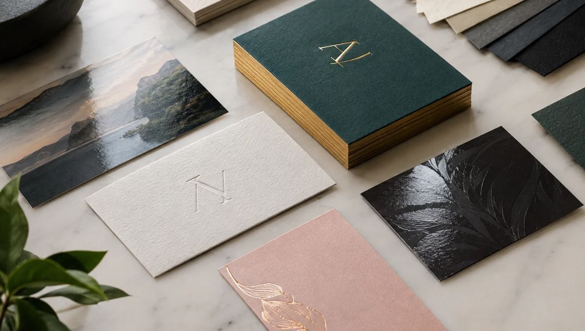
A business card can look impressive on a computer screen and still feel disappointing in your hand. True quality comes from the combination of paper stock, thickness, printing accuracy, color reproduction, surface treatment, and finishing techniques. The right choices depend on the brand, industry, design, and intended use—not simply on choosing the thickest or most expensive material. Paper weight, for example, can be expressed in GSM or points, with higher GSM generally indicating a heavier, sturdier sheet, while finishes such as matte, gloss, soft touch, foil, and raised or spot gloss can dramatically change both appearance and tactile experience.
For businesses looking for business cards in NYC, these details matter because a card is often one of the few physical pieces of branding that a prospect can hold onto after a meeting. Whether you need sophisticated stationery for a professional firm, memorable cards for a creative business, or quality business cards NYC companies can confidently hand to clients, the production choices should support your brand rather than distract from it. If you’re planning a new project, contact Japan Printing to request a quote for your business card design and printing needs.
Start With the Paper: Weight, Thickness, Texture, and Finish
The paper is the physical foundation of a business card, so it is one of the first things to examine when judging quality. Two cards can use exactly the same artwork but feel completely different because they are printed on different stocks. Paper weight is commonly described using measurements such as GSM and points. GSM means grams per square meter, while points generally refer to the thickness of the sheet. These measurements are related to how substantial a card feels, although they describe different characteristics.
A quality business card does not necessarily have to be the thickest possible option. Instead, the stock should match the purpose and personality of the brand. A minimalist consulting firm might prefer a smooth, understated stock, while a luxury brand could benefit from a thicker, textured material. Extra-heavy cards can create a substantial tactile impression, but practical considerations such as cost, storage, portability, and compatibility with the design should also be considered. MOO, for example, offers business card stocks ranging from approximately 350 GSM to 600 GSM, illustrating how dramatically available paper weights can vary.
When evaluating paper, consider:
Weight: Heavier stocks generally feel more substantial.
Thickness: A thicker card can create a premium tactile impression.
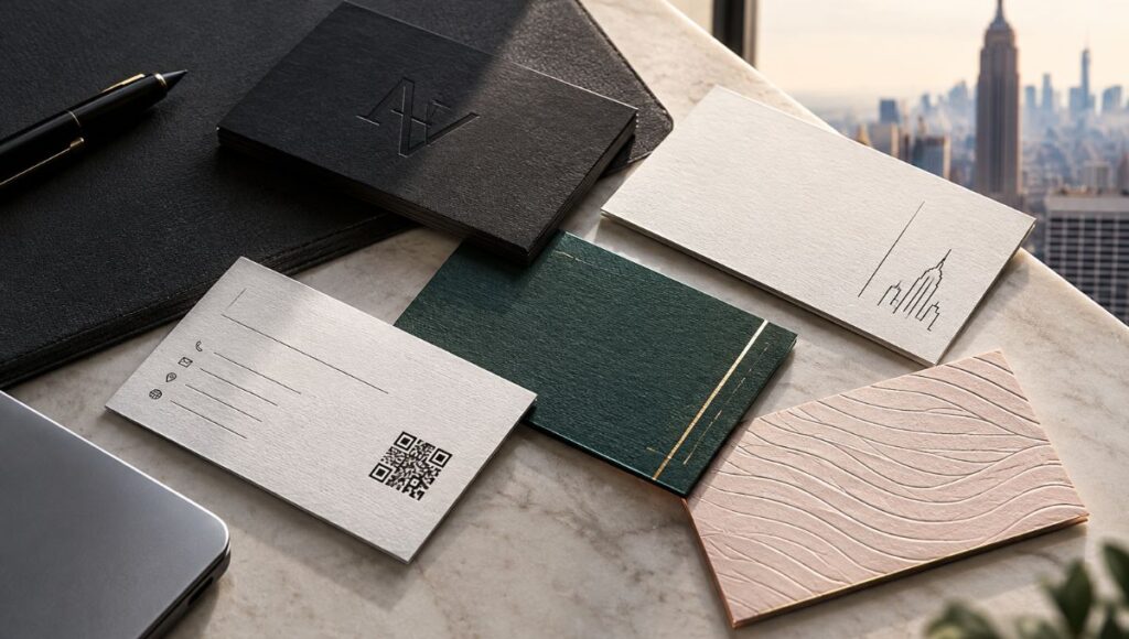
Texture: Smooth, cotton, and naturally textured stocks can produce very different experiences.
Coating: Matte and gloss surfaces affect both appearance and how colors are perceived.
Writing surface: If recipients may need to write on the card, the surface should be suitable for that purpose.
Brand alignment: The stock should reinforce the visual identity rather than compete with it.
Uncoated papers can provide a more natural, tactile appearance, while coated or laminated stocks can produce smoother surfaces and stronger visual effects. Gloss finishes can be particularly useful when the design contains photography or vibrant colors because the reflective surface can make those elements stand out. Matte finishes, by contrast, offer a more subdued, glare-resistant appearance.
For quality business cards NYC businesses can use confidently, the goal is not simply to select the heaviest paper available. The better approach is to select a stock that feels intentional and works with the design, printing method, and finishing techniques.
Look Closely at Printing Quality and Color Reproduction
Even premium paper cannot compensate for poor printing. A high-quality business card should have crisp typography, clean edges, consistent colors, and accurately reproduced logos and graphic elements. Small details become especially important because business cards are compact. A slight printing problem that might be difficult to notice on a large poster can become obvious when it appears around a small logo, thin line, or fine piece of text.
Color consistency is another important consideration. Brand colors should be reproduced as accurately as possible, particularly when a business card needs to match other stationery, packaging, signage, or marketing materials. The appearance of a color can also change depending on the paper and finish used. A glossy surface, for example, can produce a different visual effect from an uncoated stock.
Before approving a business card for production, examine:
- Logo clarity: Edges should look sharp rather than fuzzy or pixelated.
- Typography: Small text should remain legible and properly reproduced.
- Color consistency: Large areas of color should appear even and intentional.
- Image quality: Photographs and detailed graphics should retain sufficient resolution.
- Alignment: Text, logos, borders, and other elements should be positioned consistently.
- Trim and bleed: Important information should remain safely inside the finished cutting area.
- Double-sided registration: Elements printed on both sides should align correctly.
Professional preparation is particularly important when designs contain borders or graphics close to the edge. Templates and production guidelines commonly distinguish between the bleed area, trim line, and safe area so that important design elements are not accidentally cut during finishing.
Printing quality should also be considered alongside readability. A visually elaborate card is not necessarily a better card if the contact information is difficult to read. MOO’s paper guide similarly emphasizes readability and recommends ensuring that fonts remain sufficiently visible with the selected design and finish.
For businesses ordering business cards in NYC, this is particularly relevant when the card forms part of a larger identity system. A carefully produced business card should look like it belongs with the company’s letterhead, envelopes, presentation materials, packaging, and other branded stationery.
Ultimately, quality printing should make the design look intentional—not draw attention to the printing process itself.
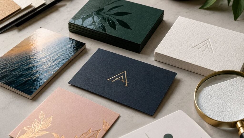
Understand Finishes: Matte, Gloss, Soft Touch, Foil, and Spot Effects
Finishing is where a business card can acquire an additional visual or tactile dimension. However, special finishes work best when they have a purpose. Adding multiple effects simply because they are available can make a card visually complicated. The strongest designs usually use finishing techniques selectively to emphasize a logo, important detail, texture, or particular aspect of the brand.
A few common options include:
Matte finish provides a smooth, relatively low-glare surface and is often appropriate when the goal is a restrained, professional appearance. It can work particularly well with minimalist typography and sophisticated color palettes.
Gloss finish creates a more reflective surface and can enhance the visual impact of photographs and colorful artwork. It may be particularly appropriate for photographers, restaurants, fashion businesses, or brands that rely heavily on imagery.
Soft-touch finishes are designed to create a smooth, tactile surface. MOO describes its Soft Touch cards as having a velvet-like feel and combines them with options such as foil and spot gloss.
Foil stamping can introduce metallic elements such as gold or silver to selected portions of a design. It is frequently used to emphasize logos, names, borders, or other decorative details.
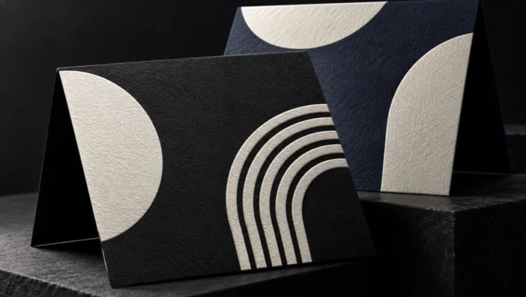
Spot UV or spot gloss applies a glossy effect only to selected areas rather than covering the entire card. This creates contrast between the treated and untreated portions of the design. Raised versions can add an additional tactile component.
Letterpress or debossing can create physical impressions in the paper. MOO’s letterpress cards, for example, use a thick textured stock combined with a debossed design to create a tactile result.
When deciding on a finish, ask:
Does it reinforce the brand?
Does it make an important element easier to notice?
Does it complement the paper stock?
Will it preserve readability?
Is the effect appropriate for the business and audience?
A luxury law firm, fashion studio, restaurant, architect, real-estate professional, and technology startup may all require completely different approaches. There is no single finish that automatically makes a card high quality.
The objective is controlled contrast and purposeful detail. For businesses seeking quality business cards NYC customers will remember, a carefully selected finish can add character without overwhelming the underlying design.
Evaluate the Finished Card as a Complete Brand Experience
The final test of a high-quality business card is not simply whether it has expensive paper or a special finish. It is whether all of the components work together. A premium stock paired with inaccurate colors, poor typography, or an overcrowded layout will not necessarily create a successful card. Conversely, a relatively straightforward design can feel highly professional when its materials, printing, and finishing have been carefully coordinated.
Think about the card from the recipient’s perspective. The first impression may come from the visual design, but the experience continues when the person picks it up. They notice its weight, surface, texture, color, and rigidity. They also need to find the information they need quickly.
A useful final checklist includes:
- Does the card feel sturdy enough for its intended use?
- Is the paper appropriate for the brand?
- Are colors consistent with the company’s identity?
- Is all contact information easy to read?
- Are the logo and graphics sharp?
- Are the edges clean and accurately trimmed?
- Does the finish enhance rather than obscure the design?
- Do front and back designs work together?
- Does the card look professional under different lighting conditions?
- Does the physical result match what was expected from the digital proof?
It is also worth considering practicality. A card that is extremely thick may feel luxurious but may take up more space in a wallet or card holder. A highly glossy surface may make colors vibrant but can introduce reflections. An uncoated surface may provide a natural texture but produce a different visual result from coated stock. These are not necessarily advantages or disadvantages; they are design decisions that should correspond to the project’s priorities.
Paper guides from professional printers demonstrate that different stocks are designed for different purposes, from photography-friendly glossy surfaces to textured and extra-thick papers intended to create a more tactile experience.
This is why choosing business cards in NYC should involve more than comparing prices and quantities. The production process should consider the entire identity system. When paper, printing, typography, color, and finishing are coordinated, the result can feel considerably more polished than a standard card produced without attention to those details.
For a business investing in quality business cards NYC, the finished product should communicate the same level of care that the company wants customers to associate with its services.
Conclusion
A high-quality business card is the result of several decisions working together: an appropriate paper stock, sufficient thickness, accurate printing, strong color reproduction, readable typography, precise trimming, and finishing techniques that complement the design. There is no universal combination that works for every company. The right solution depends on the brand, audience, industry, budget, and way the cards will be used. Research into business card stocks also shows why paper weight alone should not determine quality; texture, finish, durability, appearance, and practicality all contribute to the final result.
If you’re planning business cards in NYC and want a professionally designed and printed result, Japan Printing can help you develop the right combination of design, paper, printing, and finishing for your project. Contact Japan Printing today to request a quote for your business card design and creation project and create quality business cards NYC clients and prospects will be happy to keep.