Stationery 05.03.25
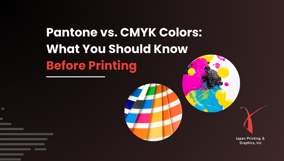
Pantone vs. CMYK Colors: What You Should Know Before Printing

Daniel Cantor
When it comes to creating professional stationery materials like business cards, envelopes, letterheads, note cards, and more, color accuracy is not just an aesthetic issue—it’s a statement about your brand. One of the most critical aspects to consider before printing is choosing the right color system: Pantone or CMYK. This decision can make a big difference in how your printed materials are perceived.
Whether you’re designing business cards in NYC or creating a full line of corporate stationery, it’s essential to understand the differences, advantages, and limitations of each system. In this article, we’ll dive deep into both color models and help you decide which is best for your project.
Ready to take your professional image to the next level? Get a quote today for your business cards and printed materials with Japan Printing and ensure your visual identity looks exactly as you envision it.
What is the CMYK System and How Does It Work?
The CMYK model is the standard for full-color printing. CMYK stands for Cyan, Magenta, Yellow, and Key (Black)—the four ink colors that combine in various proportions to create a wide range of colors. This system is based on subtractive mixing, meaning color is created by subtracting light from white paper using ink.
Advantages of the CMYK system:
- Ideal for printing photographs or multi-colored designs
- More cost-effective than Pantone for large print runs
- Produces more natural and subtle color variations
Limitations:
- Color accuracy may vary depending on the printer, paper, and other factors
- Not ideal for brand-specific colors requiring absolute consistency
- Some bright or metallic shades cannot be replicated with CMYK
This system is a great choice for general materials like brochures, flyers, and basic corporate stationery. However, if you’re working on business cards in NYC where visual identity must be flawless, Pantone might be a better option.
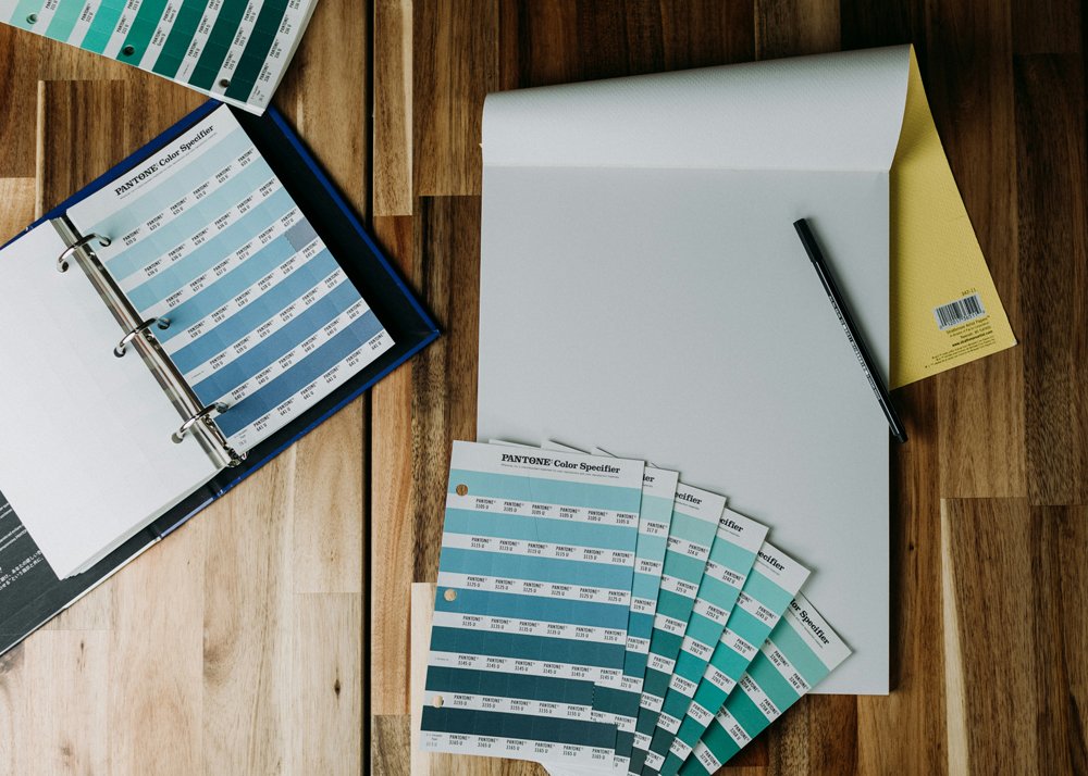
What is the Pantone System and Why is It So Precise?
The Pantone system, also known as the Pantone Matching System (PMS), uses pre-mixed inks instead of blending colors during printing. This allows for consistent and exact color reproduction, making it the preferred choice for brands that need to maintain visual identity with precision.
Advantages of the Pantone system:
- 100% color consistency regardless of printer or paper used
- Perfect for specific corporate colors
- Allows printing of special tones like metallics, neons, or pastels
Why choose Pantone for stationery?
- Your logo features a very specific color
- You want a more professional and uniform finish on your business cards, envelopes, or letterheads
- You’re working on a high-end visual identity
Although Pantone can be more expensive, its precision justifies the investment—especially for projects where detail and visual quality are paramount. If your company is committed to a solid professional aesthetic, Pantone is the ideal path.
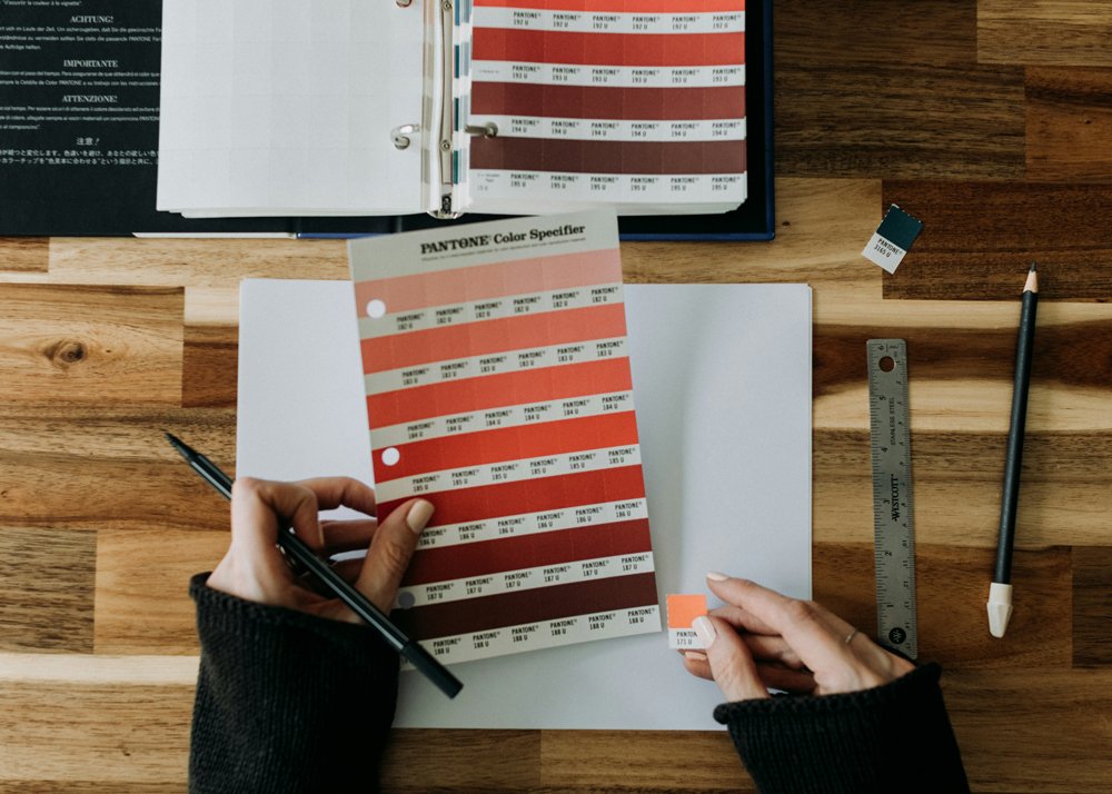
When to Use Pantone or CMYK for Your Stationery Materials
The decision between Pantone and CMYK depends on the type of project, the budget, and quality expectations. Here’s a general guide to help you choose:
Use CMYK when:
- You’re printing in large quantities
- Your design includes photographs or gradients
- You have a limited budget
- You don’t need exact precision for your brand colors
Use Pantone when:
- You require specific brand colors
- You want consistency across different print runs
- You’re creating premium business cards or luxury stationery
- You need special colors (neon, metallics)
It’s also possible to combine both systems in a single print job: CMYK + Pantone. For example, you can use CMYK for the general design and add a Pantone color to highlight the logo. This technique is widely used in business cards in NYC looking to stand out in a competitive environment.
The Impact of Color Choice on Your Brand Image
Color isn’t just a visual element—it conveys emotion, values, and professionalism. Color consistency in your stationery speaks directly to the quality of your brand. Imagine handing out a business card where the logo color varies slightly with each new print run. That detail, though small, can affect how your company is perceived.
Factors that influence color perception:
- Type of paper used (matte, glossy, textured)
- Type of ink (water-based, UV, metallic)
- Printing method (offset vs. digital)
Benefits of maintaining a consistent visual identity:
- Strengthens brand recognition
- Builds trust and credibility
- Enhances your professional image with clients and partners
At this point, choosing Pantone for your stationery—especially business cards—can make a big difference, as it ensures your visual identity remains consistent and professional across all printed materials.
How to Work With Designers and Printers to Ensure Color Fidelity
One of the most common mistakes is designing without considering the print system from the start. To avoid surprises, it’s essential to communicate clearly with your designer and printer from the beginning of the project.
Tips for working effectively with professionals:
- Define early on whether you’ll use Pantone or CMYK
- Request a color proof before printing the full batch
- Specify the exact Pantone codes in your design file
- Use color profiles compatible with your chosen system
- If using CMYK, make sure your monitor is properly calibrated
It’s also recommended to work with print shops experienced in business cards in NYC, as they understand the importance of detail, presentation, and visual impact in a highly competitive market.
Conclusion
Choosing between Pantone and CMYK may seem like a technical detail, but in the world of corporate stationery, it can make a huge difference in how your brand is perceived. While CMYK offers versatility and cost-efficiency, Pantone provides precision and consistency—key values in branding.
If you’re about to print business cards, envelopes, letterheads, or any other stationery material, make sure you choose the right color system. And remember—you’re not alone in this process.
Get a quote today with Japan Printing and ensure your business cards in NYC reflect the quality, professionalism, and style your brand deserves. Your image begins on paper!