Business Cards 07.15.25
Retro Business Cards: Aesthetic Inspired by the 60s, 70s, and 80s

Daniel Cantor
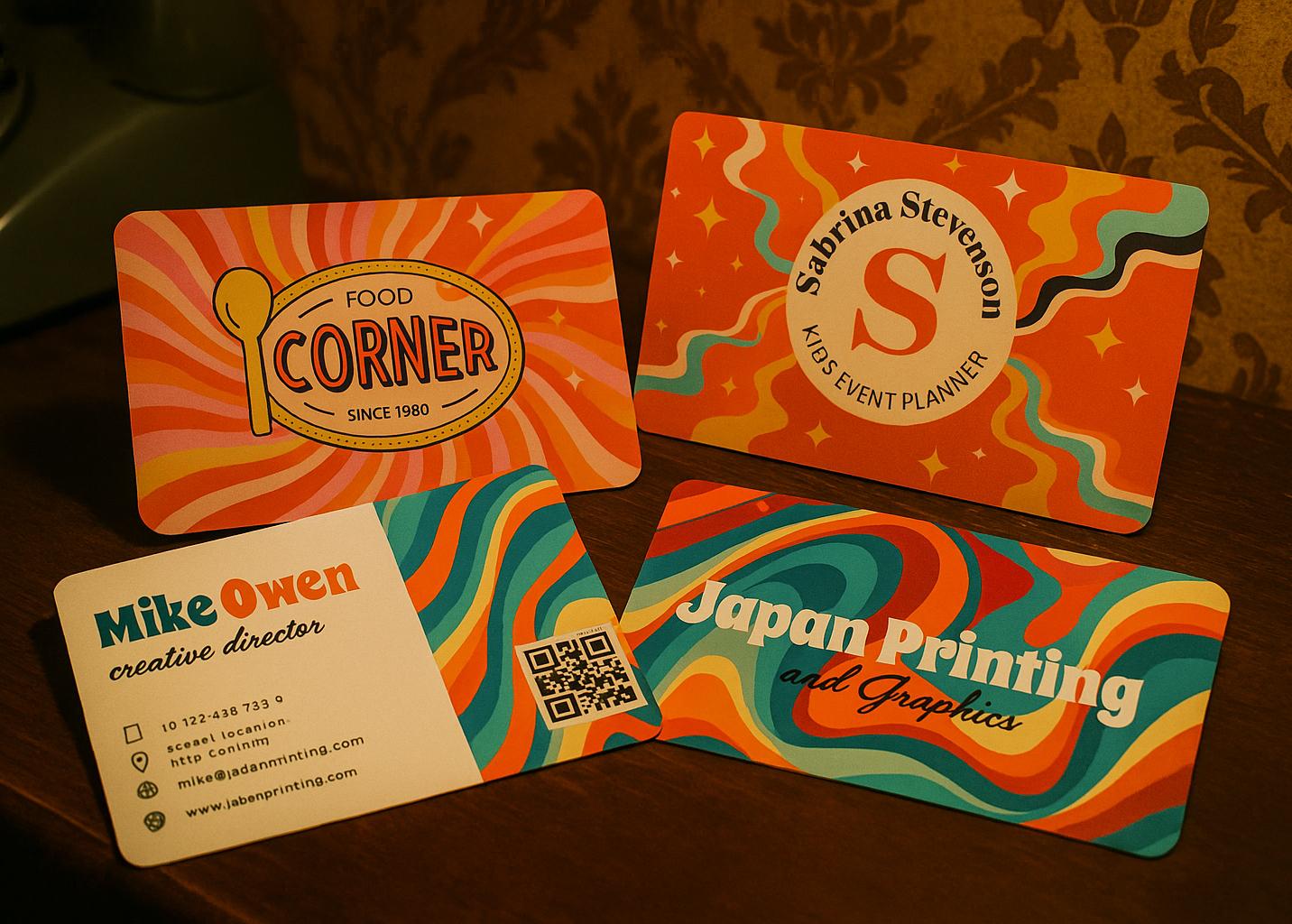
In an increasingly digital world, business cards remain a crucial element for making a powerful first impression. Today, design trends have taken a nostalgic turn, and retro business cards—drawing inspiration from the aesthetics of the 60s, 70s, and 80s—are gaining popularity among creatives, entrepreneurs, and brands looking to stand out with style.
These cards combine vibrant colors, iconic typography, and classic patterns to evoke a sense of authenticity and originality that resonates with modern audiences. If you’re looking for business cards in NYC that truly grab attention, a retro design may be the perfect choice for you.
Want to create your own retro-style cards? Get a quote from Japan Printing, where quality and creativity come together to produce unforgettable pieces.
60s Aesthetic: Psychedelic Elegance and Modernism
The 1960s witnessed an aesthetic revolution that broke away from tradition. In graphic design, this translated into an explosion of color, organic shapes, and psychedelic typography. Retro business cards inspired by this era stand out for their dynamic, bold visual approach—ideal for creative, artsy, or fashion-forward brands.
Common features of 60s-style cards:
- Vibrant colors: Fuchsia, orange, turquoise, and yellow combinations
- Abstract geometric shapes: Concentric circles, spirals, daisy-like flowers
- Psychedelic typography: Wavy, groovy lettering full of movement
- Pop art inspiration: Thick lines, strong contrasts, bold silhouettes
This type of card is perfect for those who want to break the mold and make a bold visual statement. If you’re looking for a business card maker in NYC who can capture this psychedelic essence, be sure to choose a provider experienced in high-fidelity printing and custom design.
70s Aesthetic: Earth Tones, Texture, and Bold Typography
The 70s marked a shift toward a more earthy and natural aesthetic—but one that was no less expressive. Retro business cards from this decade are perfect for businesses that want to convey a sense of trust, warmth, and professionalism with a vintage twist.
Key elements of 70s-style business cards:
- Warm color palettes: Brown, mustard, beige, burnt orange, and olive green
- Bold typography: Slab serif or thick fonts full of personality
- Textured designs: Background patterns like diagonal lines, dots, or simple floral motifs
- Use of space: Centered, symmetrical, and clean layouts
This style is ideal for creative studios, sustainable brands, cafés, consultants, and more. A card inspired by the 70s can communicate both tradition and creativity in balance. If you’re seeking quality business cards in NYC, make sure the finish, paper, and printing preserve the retro look without compromising modern quality.
80s Aesthetic: Neon, Futurism, and Maximalism
The 1980s were bold, electric, and unapologetically excessive. Business cards inspired by this era are perfect for those who want to stand out with a bold, high-energy design. This style is especially well-suited for brands in tech, entertainment, or urban fashion.
Defining features of 80s-style cards:
- Neon colors and strong contrasts: Hot pink, electric blue, black, and white
- Digital and futuristic aesthetics: 3D grids, vector lines, synthwave style
- Angular or pixelated typography: Fonts reminiscent of video games and old computers
- Retrofuturistic icons: Cassettes, lightning bolts, stars, vector-art inspired graphics
This aesthetic can be an unforgettable first impression at trade shows, product launches, or creative events. With the help of a business card maker in NYC, you can create cards that not only evoke the 80s but also wow everyone with their originality and professional finish.
How to Choose the Right Retro Aesthetic for Your Brand
Choosing the right aesthetic for your retro business cards depends on several key factors: your business niche, your target audience, and the visual identity you want to convey. Here are some practical tips to help you make the best decision:
- Know Your Audience
- If your audience is young, creative, and alternative, an 80s aesthetic might be ideal.
- For audiences who value organic and handmade products, the 70s are a great option.
- If you want to stand out at artistic or cultural events, the 60s look will be highly effective.
- Align the Design with Your Branding
- Ensure that the colors and typography match your logo and overall visual tone.
- Use retro symbols or patterns only if they enhance your message—don’t overcrowd the design.
- Choose Quality Materials
- Design isn’t everything: paper type, finish (matte, glossy, textured), and details like embossing or UV coating matter too.
- Japan Printing offers quality business cards in NYC that don’t just look good—they last and communicate professionalism.
Conclusion:
Retro business cards offer a unique way to stand out and express your or your brand’s personality from the very first interaction. Whether you choose the psychedelic energy of the 60s, the warm vibes of the 70s, or the bold flair of the 80s, what matters most is that your card is both memorable and professional.
If you’re looking for business cards in NYC that blend vintage design with modern print quality, get a quote from Japan Printing today. Take your branding to the next level with creative, durable, and fully personalized cards.