Business Cards, Stationery 08.24.26
The “Anti-AI” Design Trend: Why Handmade-Looking Print Is Making a Comeback

Daniel Cantor
Artificial intelligence has made it easier than ever to create polished images, layouts, illustrations, and brand concepts in seconds. Yet at the same time, a contrasting design movement is gaining momentum: brands are deliberately embracing textures, irregularities, handwritten elements, analog photography, collage, visible printing effects, and other visual signals that feel distinctly human. This emerging “Anti-AI” aesthetic does not necessarily mean rejecting artificial intelligence. Instead, it reflects a growing desire for work that communicates craft, personality, physicality, and intention. Adobe’s 2026 Creative Trends report identifies a broader movement toward content that people can “touch, taste, hear, and feel,” while noting that audiences are increasingly embracing messy, tactile, and analog experiences as AI becomes more sophisticated.
For businesses, this shift creates an important opportunity in physical branding. A thoughtfully designed business card can communicate qualities that a perfectly polished digital image cannot reproduce: paper texture, pressure, ink, embossing, debossing, grain, and the subtle imperfections of a physical object. If you are considering a brand refresh or want printed materials that feel more personal, contact Japan Printing to quote your design and business card project. Whether you need distinctive business cards in NYC, stationery, or a complete printed identity, the right combination of design and production can turn “human” into something customers can actually hold.
What Is the “Anti-AI” Design Trend?
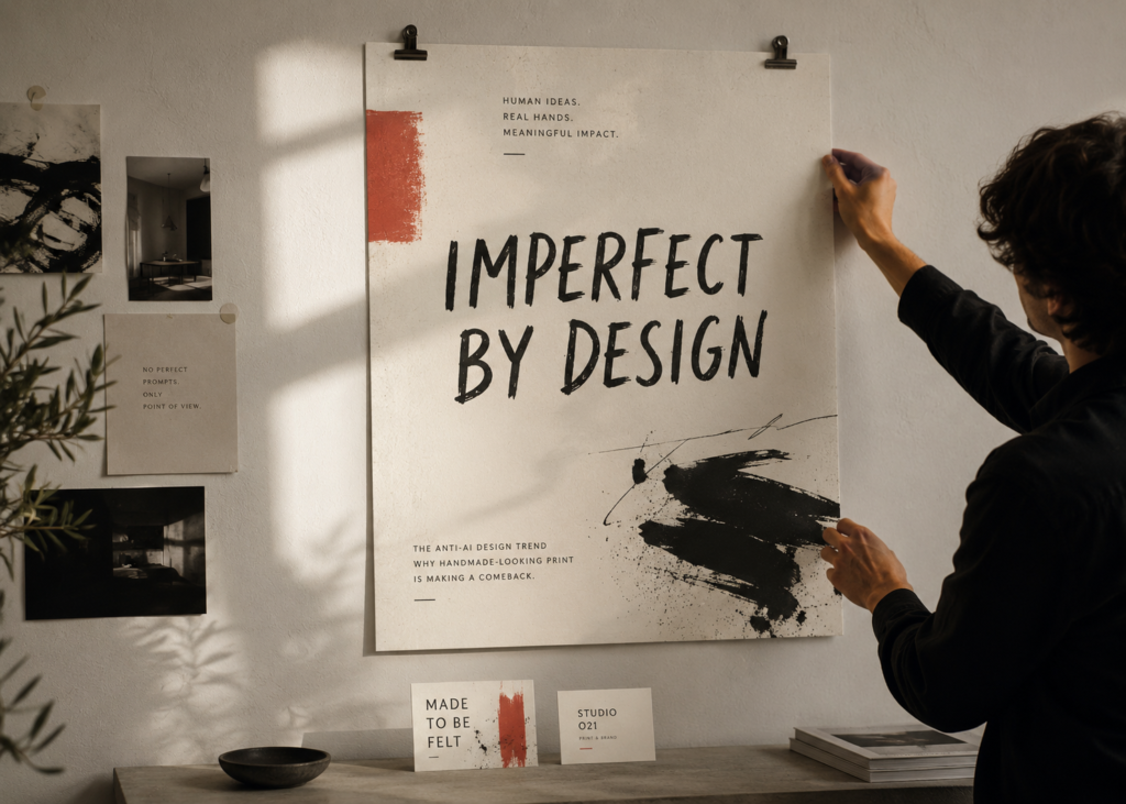
The term “Anti-AI” design is best understood as a visual direction rather than a strict rejection of artificial intelligence. It describes an increasing preference for design that communicates evidence of human involvement. Instead of perfectly symmetrical compositions, immaculate gradients, flawless illustrations, and endlessly smooth digital surfaces, designers are experimenting with characteristics traditionally associated with handmade work.
Recent industry coverage has explicitly connected this movement with the growing presence of AI-generated imagery. drupa’s 2026 analysis describes “Anti-AI craft” as an aesthetic built around human and analog signals, including collages, hand marks, halftone textures, Risograph-inspired effects, imperfect edges, visible overprinting, and purposeful grain. Design & Paper similarly describes the movement as a shift toward intention, tactility, material knowledge, and human storytelling in branding, packaging, print, and paper.
Common characteristics include:
- Hand-drawn typography or lettering
- Rough or imperfect lines
- Analog photography
- Paper and ink textures
- Visible grain and halftone patterns
- Physical collage
- Slightly irregular illustrations
- Vintage printing references
- Natural materials and tactile surfaces
- Handmade-looking marks, stamps, or annotations
- Limited color palettes that resemble traditional printing processes
The important distinction is that “imperfect” does not mean “poorly designed.” In effective Anti-AI design, imperfections are intentional. A designer might introduce a slightly uneven texture to make a brand feel warmer, use an imperfect illustration to communicate personality, or select an uncoated paper stock because its physical surface supports the brand story.
This distinction matters particularly for premium stationery. A business card does not need to look unfinished to look human. A carefully chosen stock, subtle embossing, letterpress-inspired typography, deckled details, or restrained ink texture can create a sense of craftsmanship while maintaining professional standards. That makes the aesthetic especially relevant to luxury business cards nyc, where differentiation often depends on details that competitors cannot communicate through a standard digital template.
Why Handmade-Looking Design Is Appearing Now
The resurgence of handmade-looking design is not happening in isolation. It is part of a broader cultural response to an increasingly automated and screen-based environment. As generative AI makes polished visual content easier to produce, visual perfection itself becomes less distinctive. When thousands of brands can quickly generate sophisticated-looking graphics, characteristics associated with human effort can become more valuable.
Adobe’s 2026 Creative Trends research describes audiences as embracing tactile and analog experiences while AI and AR technologies become increasingly sophisticated. Its “All the Feels” trend specifically emphasizes sensory engagement and content that goes beyond purely visual communication. Adobe’s earlier research also identified increasing demand for multisensory experiences, including interactions involving touch, sound, and physical environments.
Consumer trends provide another indication of this appetite for personality and craftsmanship. Etsy’s 2025 trend reports highlighted personalization, nostalgia, handmade accessories, handcrafted cards, natural textures, vintage references, and products that feel unique or meaningful. In its Mother’s Day report, Etsy reported double-digit growth in greeting-card sales compared with the previous year and emphasized personalized, handcrafted, and emotionally meaningful products. Its fall and winter report similarly identified personal expression, nostalgia, comfort, and pieces that tell a story as important seasonal themes.
For brands, this creates an interesting paradox: technology can make human-looking design easier to reproduce, but physical print can make human experience more convincing.
Consider what happens when someone receives a business card. They can:
- Feel the weight and texture of the stock.
- See how ink interacts with the paper.
- Notice raised or recessed elements.
- Observe subtle imperfections in texture or finish.
- Keep the card instead of immediately closing a browser tab.
- Associate the physical object with the person and brand that gave it to them.
That is why the Anti-AI movement should not be interpreted simply as “make everything look old.” The real opportunity is to create a human signal. For nyc business card services, this could mean combining contemporary typography with tactile paper, or minimalist branding with a physical finish that gives the card personality.
The strongest designs are not nostalgic for nostalgia’s sake. They use analog qualities because those qualities help communicate something about the business.
How to Bring the Anti-AI Aesthetic Into Business Cards and Stationery
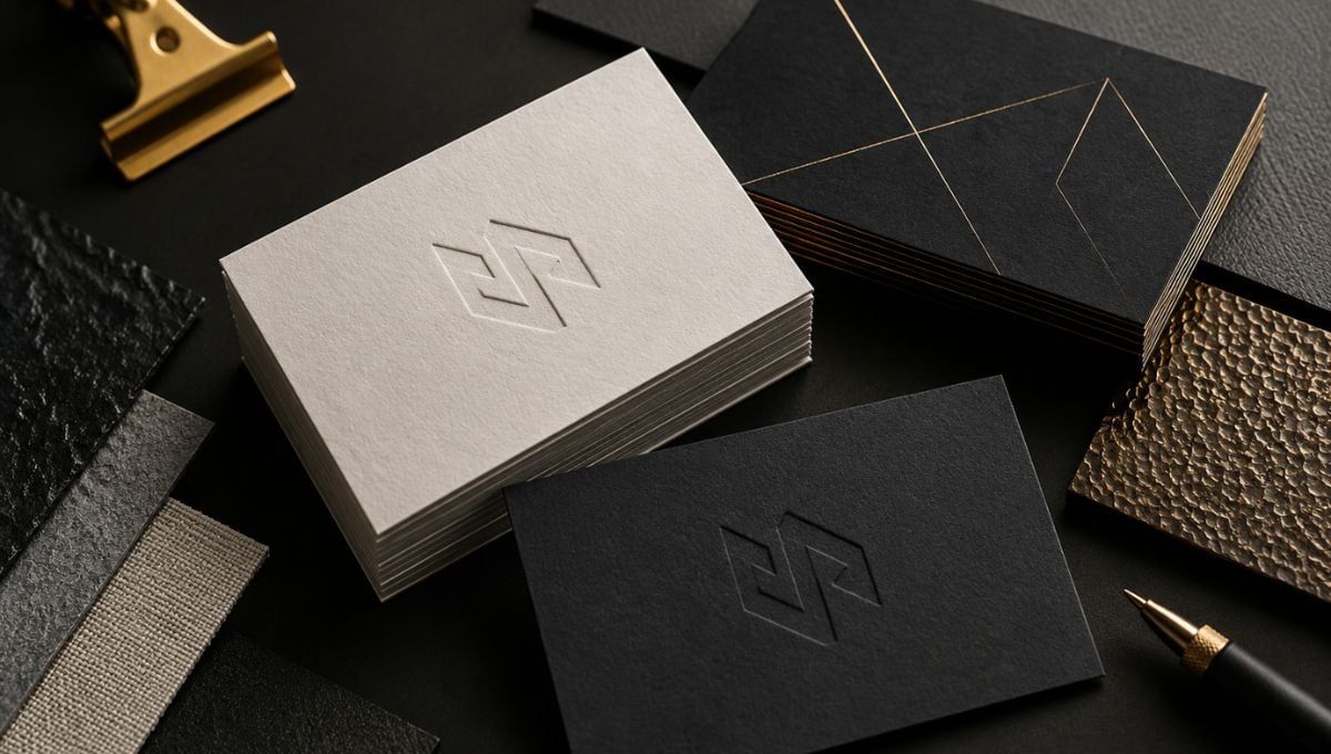
Print is one of the most natural places for this trend because paper, ink, texture, and finishing techniques already provide the physical qualities that digital media struggles to replicate. drupa’s 2026 print-design analysis describes tactile printing as a major advantage of physical media, highlighting embossing, debossing, raised varnish, textured papers, and matte-versus-gloss contrasts.
The key is restraint. If every possible texture and finish is added to a business card, the result can become visually noisy rather than authentic. A stronger approach is to select one or two physical characteristics that reinforce the brand.
For example:
1. Textured paper
Uncoated and textured stocks can immediately introduce a more natural, material quality. Instead of relying on a digital texture that imitates paper, the recipient actually experiences the paper itself.
2. Embossing and debossing
Raised or recessed elements introduce depth without requiring the entire design to become elaborate. A logo, monogram, or small typographic detail can become a physical part of the identity.
3. Subtle ink irregularity
Controlled variations in texture, halftone patterns, or analog-inspired printing effects can make artwork feel less sterile. The objective is not to create random defects but to reproduce the visual character associated with physical printing.
4. Hand-drawn elements
Illustrations, signatures, icons, borders, or lettering can introduce personality. These elements work particularly well for restaurants, creative studios, independent professionals, hospitality brands, fashion businesses, and artisanal companies.
5. Vintage printing references
Risograph-inspired color separation, halftones, limited inks, archival typography, and retro illustration can create an analog atmosphere while still allowing the overall composition to feel contemporary.
6. Material contrast
Combining smooth and textured surfaces, matte and gloss areas, or different paper characteristics can make a card more interesting to touch.
These techniques can also work within a luxury aesthetic. In fact, luxury business cards nyc do not necessarily have to rely on ultra-clean black-and-white layouts, metallic foil, or perfectly symmetrical compositions. Luxury can also come from craftsmanship and material specificity.
The most successful premium cards often communicate quality through what happens when the recipient physically interacts with them. This is particularly relevant for business cards in NYC, where professionals frequently exchange cards during meetings, networking events, conferences, hospitality experiences, and client introductions. A tactile detail gives the recipient another reason to remember the interaction.
Japan Printing has similarly highlighted the relationship between tactile branding and business cards, noting that materials, coatings, dimensional effects, and metallic details can create different sensory experiences.
Anti-AI Does Not Mean Anti-Technology
One of the biggest misconceptions about this trend is that brands must completely abandon digital tools to participate in it. They do not. In fact, the strongest Anti-AI-inspired work can combine modern technology with physical craftsmanship.
Adobe’s own discussion of analog design illustrates this relationship: designers working with handmade practices still use digital tools for concept development, production, mockups, editing, and other parts of the creative process. The objective, therefore, is not necessarily to determine whether a design was created “by hand” or “with AI.” The more useful question is whether the final result communicates a meaningful human point of view.
That distinction becomes increasingly important because handmade-looking aesthetics can themselves become repetitive. If every brand adopts the same cream background, serif typography, grain overlay, hand-drawn squiggles, and imperfect illustrations, the supposedly “human” aesthetic can become another standardized template.
Recent commentary has already raised this concern. Fast Company reported in August 2026 on brands increasingly using hand-drawn typography, scanned textures, retro references, and intentionally imperfect forms as they attempt to appear more human in an AI-saturated environment. Other recent design commentary has similarly warned that handmade signals can become generic when they are disconnected from the actual product, history, or culture of a brand.
That means designers should start with the brand rather than the trend.
Ask:
- What should the customer feel?
- What physical qualities relate to the business?
- Does the company have a craft, heritage, or story that can influence the design?
- Would a textured stock reinforce the positioning?
- Could a handwritten element add personality without reducing professionalism?
- Is the imperfection meaningful, or is it simply decorative?
- Would a tactile finish make the piece more memorable?
This approach prevents the Anti-AI aesthetic from becoming another visual gimmick.
For example, a boutique architect might use restrained typography and tactile stock rather than obvious “handmade” graphics. A restaurant could incorporate illustrations inspired by its kitchen or neighborhood. A creative director might use experimental typography and analog photography. A luxury consultant could use subtle embossing and exceptional paper rather than deliberately rough graphics.
In each case, technology remains part of the process. Digital design tools can provide precision, while physical production introduces the material qualities that make the final piece feel tangible.
This is where experienced nyc business card services can add value: not simply by printing a digital file, but by helping translate a visual concept into a physical object where paper, ink, scale, texture, and finishing all contribute to the brand experience.
Conclusion
The “Anti-AI” design trend is less about fighting artificial intelligence and more about recognizing the value of human signals in an increasingly automated visual environment. As AI makes polished digital content faster and easier to produce, designers and brands are exploring another form of differentiation: texture, imperfection, physical materials, craftsmanship, nostalgia, and tactile experiences. Industry research from Adobe, trend data from Etsy, and developments within the print industry all point toward a broader interest in experiences that feel personal, sensory, and authentic.
For businesses, the lesson is not to make every piece of stationery look handmade. It is to make every physical detail purposeful. Whether you are developing luxury business cards nyc, refreshing your stationery system, or looking for distinctive nyc business card services, print gives your brand something digital alone cannot: a physical presence. If you are ready to turn that idea into a professionally designed and printed piece, contact Japan Printing to quote your next design, stationery, or business card project. For companies looking for memorable business cards in NYC, the right combination of concept, paper, typography, and finishing can make your brand feel unmistakably human.