Letterheads 04.19.25
The Importance of Letterhead in High-End Corporate Communication

Daniel Cantor
In a world where digital communication reigns, tangible elements still convey prestige, professionalism, and trust. Letterhead is one of those tools that, far from becoming obsolete, has evolved to remain essential in high-end corporate environments. It’s not just a printed format, but a powerful branding tool that reinforces a company’s visual identity in every physical interaction. From the first impression to the presentation of key documents, letterhead communicates elegance, organization, and a commitment to quality.
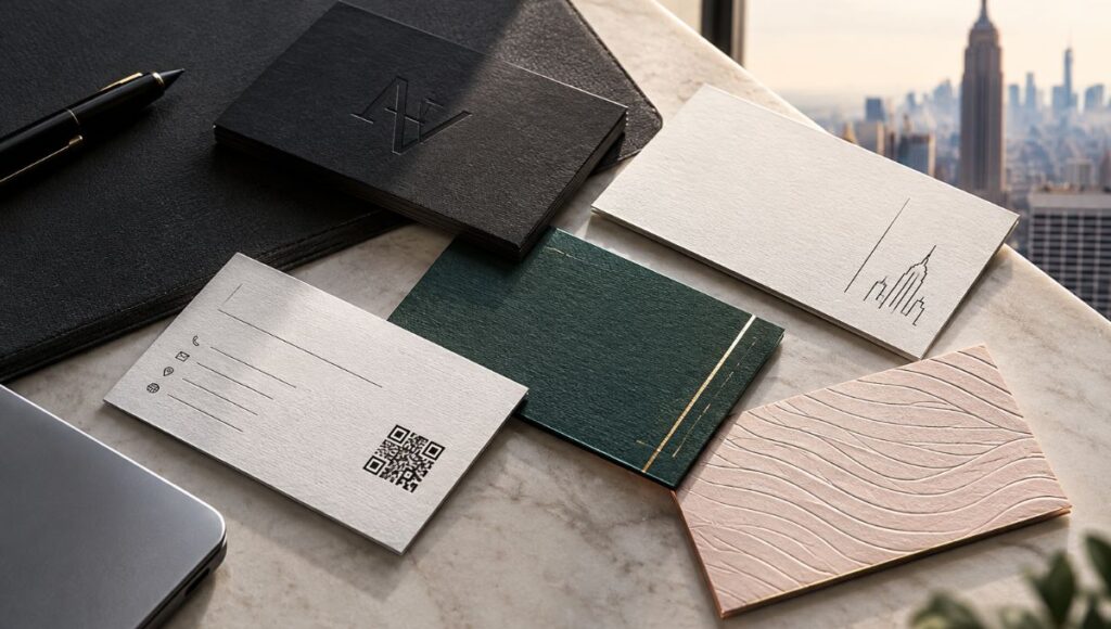
If your company seeks to project a solid and distinctive image, designing a professional letterhead should be a top priority. Moreover, this piece must align with the rest of your corporate stationery — including business cards, especially in a highly competitive market like New York City.
Ready to elevate your corporate image? Request a quote for your letterhead and business card design project with Japan Printing, specialists in premium printing and visual branding in NYC.
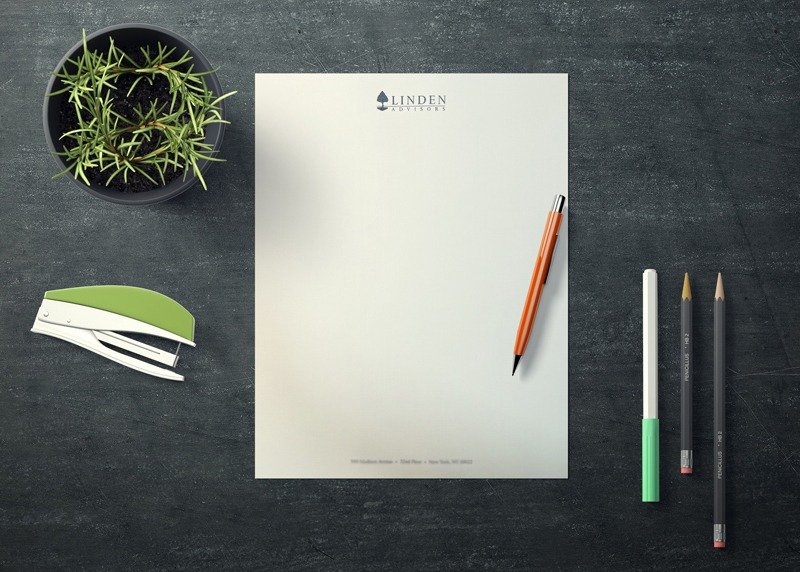
Why It Still Matters in a Digital World
Although email, video calls, and electronic formats have transformed communication, letterhead retains its value for both strategic and emotional reasons. A document printed on letterhead conveys formality and seriousness, especially in:
- Cover letters or business proposals
- Contracts and formal agreements
- Legal or institutional communications
- Corporate invitations
The sensory impact also plays a crucial role. The texture, weight, and design of the paper create a physical experience that enhances your brand’s perception of quality. In industries like architecture, law, financial consulting, or executive leadership, handing over a letter printed on premium letterhead can be the difference between closing or losing a deal.
Additionally, letterhead provides a space where your visual identity comes to life off-screen. In a world overwhelmed by digital saturation, the tangible becomes memorable. Simply receiving a physical document generates a level of attention and respect that a PDF in an email rarely achieves.
Letterhead Design: What to Include (and Avoid) for a Professional Image
Designing a professional letterhead goes far beyond placing a logo at the top of the page. It’s about creating a balanced, clear, and representative layout that reflects your company’s identity. Here are the essential elements:
What to Include:
- Company name: Preferably using your corporate font
- Logo: High-resolution and well-integrated into the design
- Physical address: Main office or headquarters
- Contact information: Phone number, email, website
- Social media: Only those that are active and up to date
- Slogan or tagline: If applicable, placed strategically
- Digital or manual signature space: If required for use
What to Avoid:
- Overloading with unnecessary information
- Hard-to-read or overly decorative fonts
- Colors that hinder printing or legibility
- Heavy backgrounds or images that distract from the content
Remember, a good letterhead functions as an extension of your brand. It should visually align with your business cards in NYC or any other printed materials. The key is achieving a clean, professional, and easily recognizable presentation.
Bilingual Letterhead: How to Design It Without Losing Style or Clarity
In international contexts or bilingual companies, it’s common for letterhead to include content in two languages, such as Spanish and English. The key to a successful design lies in organization, visual hierarchy, and aesthetics.
Tips for a stylish bilingual design:
- Clearly separate languages: Use columns, horizontal sections, or well-defined blocks
- Prioritize readability: Use simple fonts and neutral colors
- Don’t duplicate unnecessary elements: Only repeat essential data like address or social media to avoid visual redundancy
- Maintain visual balance: Both languages should have equal graphic weight to avoid confusion or unintentional hierarchy
- Use subtle dividers: Thin lines or title size differences can help separate content while preserving design harmony
Integrating two languages into your letterhead allows you to reach a broader audience without losing professionalism. Especially in multicultural cities like New York, having a bilingual version of your stationery — just like your business cards in NYC — can be a key differentiator.
Premium Paper for Letterhead: Cotton, Textured, and Other High-End Options
The material on which your letterhead is printed directly impacts how your brand is perceived. A flawless design loses its impact when printed on regular paper. That’s why high-end companies invest in premium papers that offer texture, weight, and sophistication.
Some outstanding options include:
- 100% cotton paper: Soft, elegant, and with a unique texture. Ideal for law firms and consultancies
- Textured paper (linen or laid style): Adds an artisanal feel, great for design studios or architecture firms
- Premium recycled paper: Perfect for environmentally conscious brands
- Pearlescent or satin-finish paper: Attractive for luxury, fashion, or exclusive event sectors
- High-weight cardstock: For those seeking rigidity or a stronger visual impact
Each type of paper generates a different feeling. Just like with your business cards in NYC, choosing the right paper for your letterhead speaks to your attention to detail and commitment to excellence. At Japan Printing, we help you find the perfect material based on your industry and brand personality.
How to Coordinate Letterhead, Envelopes, and Cards: Building a Consistent Visual Identity
A strong letterhead is even more effective when it’s part of a complete visual system. Consistency across letterhead, envelopes, business cards, folders, and other printed elements reinforces your company’s identity and creates a memorable brand experience.
Recommendations for a cohesive printed branding kit:
- Consistent colors: Use the same color palette across all formats
- Institutional fonts: Stick to one or two base fonts throughout your stationery
- Logo usage: Always respect the official version and its safe zone
- Modular design: Let the style of your letterhead visually translate into your envelopes and cards
- Decorative elements or patterns: If your brand uses them, apply them consistently across all formats
This professional approach conveys organization, structure, and attention to detail. Moreover, in highly competitive markets like New York, a well-designed, cohesive branding kit — with matching letterheads and business cards in NYC — can be a powerful positioning tool.
Conclusion
Letterhead is not just a formality from the past; it’s a modern tool that, when strategically designed and printed, can communicate professionalism, trust, and elegance. In a world oversaturated with digital content, print takes on a new value. And when done with premium materials and thoughtful design, it becomes a real and powerful extension of your brand.
Want to take your visual identity to the next level? Get a quote today for your letterhead and business card design and printing project in NYC with Japan Printing, experts in high-end corporate communication.