Business Cards 07.05.25
The Psychology of Color in Your Business Card

Daniel Cantor
Your business card is much more than just a small piece of cardboard with your contact information. It’s an extension of your professional identity, a communication tool, and often the first impression you make. That’s why every detail matters—especially color. Color psychology teaches us how different shades evoke specific emotions, sensations, and perceptions. Choosing the right colors can help you convey trust, creativity, professionalism, or energy, depending on the message you want to project.
If you’re looking to stand out with business cards in NYC that truly represent your brand, understanding how colors influence customer perception is essential. At Japan Printing, we help you create unique cards with designs that speak for you. Contact us today to get a quote for your business card design and printing projects!
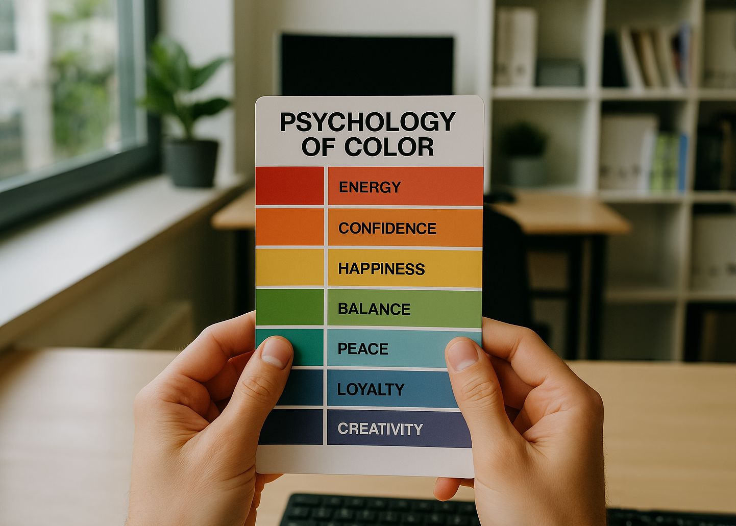
Red, Orange, and Yellow: The Colors of Action
Warm colors are powerful, energetic, and immediately grab attention. Each one conveys a particular feeling:
- Red: passion, energy, urgency. Often used in marketing to trigger immediate action.
- Orange: enthusiasm, accessibility, creativity.
- Yellow: optimism, happiness, youthfulness.
These tones are ideal for companies that want to project dynamism, such as creative agencies, youth-oriented brands, or innovative entrepreneurs. However, they must be used carefully—too much red can come off as aggressive, and poorly contrasted yellow can make text hard to read.
In the world of quality business cards NYC, these colors should be balanced with white space or neutral tones to avoid overwhelming the message. At Japan Printing, we understand how to achieve that balance so your card is eye-catching yet professional.

Blue and Green: Trust and Freshness in Your Image
Cool colors like blue and green are preferred in industries that aim to convey security, professionalism, or a connection with nature:
- Blue: trust, seriousness, loyalty. Common in banking, consulting, and tech services.
- Green: health, growth, sustainability. Ideal for eco-friendly brands or the health sector.
A business card with a dark blue background and white typography conveys authority and elegance. On the other hand, light green paired with earthy tones can suggest warmth and environmental commitment.
At Japan Printing, as expert business card makers in NYC, we guide you in applying these colors strategically to ensure your design clearly reflects your brand values.
Neutral Colors: Timeless Elegance and Sophistication
Neutral tones like white, black, gray, and beige aren’t boring—they’re elegant and versatile. Used correctly, they create a clean, modern, and professional look:
- White: simplicity, clarity, transparency.
- Black: luxury, exclusivity, authority.
- Gray: balance, seriousness, stability.
- Beige or cream: warmth, approachability, discretion.
These colors are perfect for minimalist cards where typography and layout take center stage. They also allow brighter or metallic details to stand out without losing visual coherence.
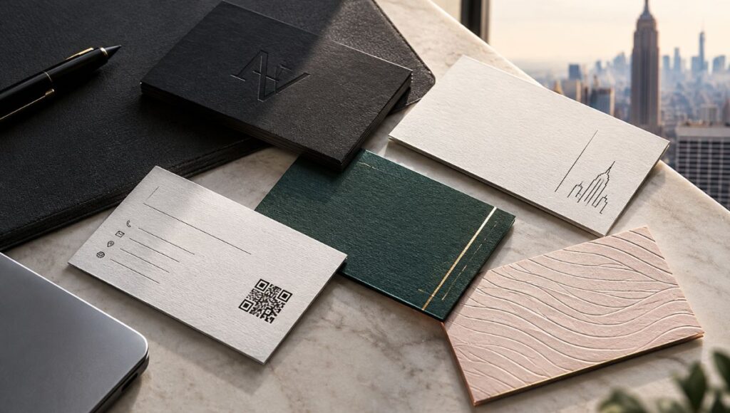
In the competitive business cards NYC market, many premium brands choose these tones to express sophistication. Japan Printing offers premium finishing options like textured paper, UV coating, or embossing to elevate these color choices even further.
The Psychology of Contrast: Combine to Stand Out
It’s not just about the color itself, but also how it’s combined. Proper contrast enhances readability and reinforces your message:
- High contrast (e.g., black on white): impact, clarity.
- Low contrast (e.g., gray on beige): subtlety, discretion.
- Complementary colors: blue and orange, red and green, purple and yellow create visual balance.
Using intentional contrasts helps direct attention to the most important elements—your name, title, or logo. It also helps organize information and makes your card more memorable.
A good business card maker in NYC like Japan Printing knows how to manage contrast for a striking design without sacrificing elegance or functionality.
Your Industry Speaks Too: Adapt Colors by Sector
Every industry has visual conventions that can help you connect more easily with your audience. For example:
- Technology: blues, grays, metallics.
- Fashion or design: black, white, and trendy seasonal colors.
- Health and wellness: greens, light blues, lilacs.
- Food and beverages: oranges, reds, browns, or greens—depending on the product.
While breaking the rules can sometimes work, knowing them is the first step. A business card with colors aligned to your industry shows you understand your market and your clients.
That’s why, when we create quality business cards in NYC at Japan Printing, we analyze your business and goals to ensure your design is not only beautiful but also effective and strategic.
Conclusion
The color of your business card is no minor detail—it’s a powerful visual communication tool. From projecting trust to conveying creativity or exclusivity, every shade tells a story about you and your business.
If you want to stand out with business cards in NYC that truly connect with your audience, let the experts guide you. At Japan Printing, we combine design, strategy, and quality so that every card speaks well of you from the very first glance.
Request your quote today and take the first step toward a professional image that leaves a lasting impression!