Business Cards 06.28.26
The Return of Serif Typefaces in Premium Business Cards

Daniel Cantor
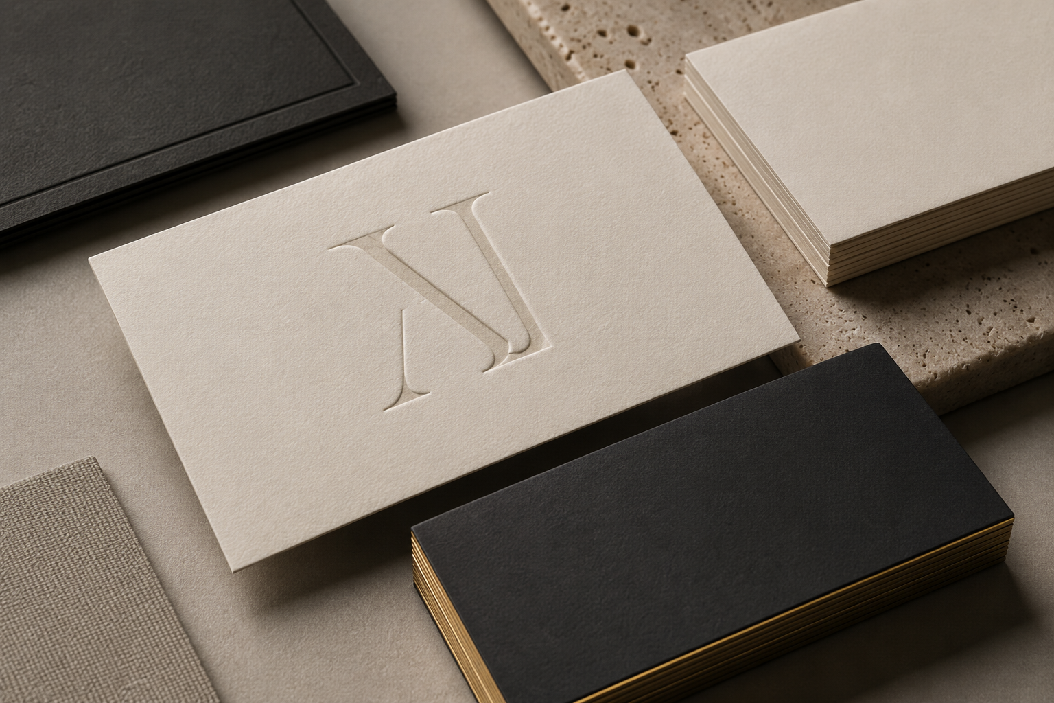
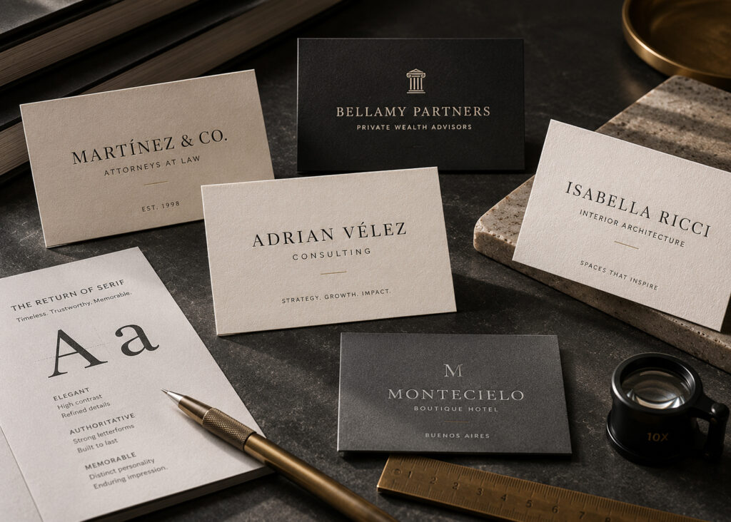
For years, minimalist design was dominated by sans serif typefaces, valued for their clean, contemporary appearance. However, in recent years, serif typefaces have made a significant comeback in premium branding, corporate identity, and especially in high-end business cards. This shift is not simply an aesthetic trend—it also reflects the desire of many brands to communicate tradition, trust, exclusivity, and sophistication without sacrificing a modern look.
In industries such as law, finance, architecture, luxury real estate, consulting, and executive personal branding, serif typefaces have regained prominence because of their ability to convey authority and character. When paired with premium papers, specialty finishes, and advanced printing techniques, they create memorable business cards that communicate professionalism from the very first interaction.
At Japan Printing, we closely follow international design trends to develop printing solutions that reflect each client’s unique identity. If you’re looking for business cards in NYC that combine elegant design, premium materials, and exclusive finishes, our team can help you create a card that stands out in any professional setting. Contact us today for a quote on your next business card design and printing project.
Why Serif Typefaces Are Making a Comeback in Corporate Design
Far from being a relic of the past, serif typefaces are experiencing a revival fueled by the evolution of contemporary branding. Major corporations, creative agencies, and luxury brands have once again embraced serif font families because they strike the perfect balance between tradition and modernity.
Several factors have contributed to this resurgence. After years of digital interfaces dominated by geometric and minimalist typefaces, many brands are looking for visual identities with greater personality and distinction. Serif fonts naturally provide that unique character.
Some of the main reasons behind their return include:
- A stronger sense of prestige and exclusivity.
- A perception of experience and professional credibility.
- Outstanding performance in high-quality printed materials.
- Elegant visual contrast when paired with sans serif fonts.
- The ability to create a memorable brand identity without relying on excessive graphic elements.
Today, many contemporary serif font families have been redesigned specifically for modern branding needs. They feature cleaner strokes, optimized proportions, and excellent readability across both print and digital media.
In the world of luxury business cards NYC, this trend has become especially important because businesses want to communicate exclusivity from the very first physical interaction with a potential client. A thoughtfully designed card featuring a carefully selected serif typeface and produced using premium printing techniques immediately conveys a higher level of professionalism.
For this reason, many companies offering NYC business card services are once again incorporating serif typography into their proposals for corporate clients, executives, and premium brands.
How to Combine Serif Typefaces with Premium Finishes for Maximum Impact
Typography is only one component of a successful business card design. Its true potential emerges when it is combined with high-quality materials and specialized printing techniques.
Serif typefaces perform exceptionally well on textured papers, cotton stocks, thick cardstocks, and luxury materials because their refined details are enhanced by the precision of modern printing methods.
Some particularly effective combinations include:
- Serif typography + gold or silver foil stamping.
- Serif typography + letterpress printing.
- Serif typography + embossing or debossing.
- Serif typography + spot UV coating.
- Serif typography + heavyweight cotton paper.
- Serif typography + painted edges.
- Serif typography + soft-touch finishes.
These finishing techniques allow every detail of the typography to stand out. For example, subtle letterpress impressions can make the delicate serifs more noticeable, while metallic foil stamping enhances the elegance of each letterform without relying on bold colors.
Maintaining a clear visual hierarchy is equally important. In many designs, the individual’s or company’s name is set in a serif typeface, while contact information appears in a modern sans serif font. This combination creates an ideal balance between sophistication and readability.
It is no coincidence that many companies specializing in luxury business cards NYC use this approach for clients in finance, law, hospitality, and real estate, where first impressions are critical. Likewise, leading providers of NYC business card services frequently recommend these typography pairings for brands seeking a premium, timeless image.
Which Industries Benefit Most from Serif Typefaces?
Although serif fonts can work across many industries, certain sectors benefit particularly from the authority, stability, and trust they naturally communicate.
These industries include:
- Law firms.
- Business consulting firms.
- Financial institutions.
- Luxury real estate agencies.
- Architecture firms.
- Interior design studios.
- Premium fashion brands.
- Private medical clinics.
- Investment firms.
- Boutique hotels.
- Executive personal brands.
In these industries, credibility is a valuable asset. An overly casual visual identity may weaken a company’s professional image, whereas a well-selected serif typeface reinforces expertise, experience, and reliability.
However, success depends on more than simply choosing a classic font. The typography must align with the unique personality of the brand. Some organizations prefer traditional serif fonts inspired by editorial publishing, while others select modern interpretations featuring cleaner, more minimalist forms.
Today’s serif families also offer multiple font weights, allowing designers to create clear typographic hierarchies without overcrowding the layout. This is especially valuable on business cards, where space is limited and every design element must serve a purpose.
For this reason, many professionals offering NYC business card services begin with a detailed analysis of the client’s brand identity before selecting the most appropriate typography. Within the competitive luxury business cards NYC market, customization remains one of the most highly valued factors for businesses looking to stand apart.
Best Practices for Designing Business Cards with Serif Typefaces
Choosing a serif typeface alone does not guarantee excellent design. Like any visual element, it should be used strategically to maintain balance and ensure an exceptional reading experience.
Widely accepted design best practices include:
- Select highly legible type families.
- Avoid using too many different fonts.
- Maintain generous white space.
- Establish a clear hierarchy between the name, title, and contact information.
- Carefully adjust letter spacing and line spacing.
- Choose font sizes appropriate for professional printing.
- Use serif and sans serif combinations when appropriate.
- Print physical proofs before final production.
Another essential consideration is the printing process itself. Some serif fonts feature extremely delicate details that require high-precision printing methods to preserve their sharpness and definition.
Color selection also plays an important role. Many premium business cards rely on restrained palettes such as black, white, ivory, navy blue, charcoal gray, and metallic finishes to reinforce the elegance of the typography.
Today, the most successful projects within the luxury business cards NYC market emphasize clean compositions where premium materials, typographic precision, and specialty finishes become the true focal points. Companies specializing in NYC business card services understand that a business card does far more than share contact information—it also communicates the quality, professionalism, and attention to detail that define a brand.
Conclusion
The return of serif typefaces demonstrates that while design trends continually evolve, the principles of elegance and effective visual communication remain timeless. Today, serif typography offers an outstanding choice for businesses and professionals seeking to project authority, sophistication, and a strong visual identity through their business cards.
When these typefaces are paired with premium materials, advanced printing techniques, and carefully considered design, the result is a business card that leaves a lasting impression and strengthens brand perception from the very first interaction.
At Japan Printing, we specialize in creating premium design and printing solutions that reflect the level of quality our clients want to communicate. Whether you’re looking for business cards in NYC, luxury business cards NYC, or expert NYC business card services, our team is ready to help you create unique, elegant, and memorable business cards. Request a quote today and discover how we can take your brand identity to the next level.