Stationery 08.20.26
What Is Tactile Branding? Why Brands Are Bringing Texture Back in 2026

Daniel Cantor
For years, branding became increasingly digital, flat, and screen-based. Logos moved onto websites, social media profiles, mobile apps, and digital advertisements where consumers could see a brand but could not physically experience it. In 2026, however, brands are rediscovering the value of something digital interfaces cannot fully reproduce: touch. Tactile branding uses physical materials, textures, finishes, weight, and dimensional details to make a brand identity something people can physically experience. Research in consumer psychology has long shown that touch can influence product evaluation, while more recent packaging research continues to explore how tactile and multisensory elements affect perceptions of quality, uniqueness, and value.
For businesses investing in physical brand materials, this creates an opportunity to make every interaction more memorable. From textured stationery and embossed logos to premium paper stocks and sophisticated finishes, tactile details can turn an ordinary printed piece into a stronger expression of a brand. If you are looking to create distinctive business cards in NYC, Japan Printing can help you design and produce stationery that communicates your brand through both sight and touch. Contact us to quote your custom design and business card project.
What Is Tactile Branding and Why Does Touch Matter?
Tactile branding is the strategic use of physical characteristics—such as texture, surface finish, thickness, embossing, debossing, and material—to communicate a brand’s personality and influence how people experience it. Instead of treating printed materials as simply a surface for graphics, tactile branding considers the physical object itself part of the identity.
This concept is closely connected to sensory marketing. Research published in the Journal of Consumer Psychology describes touch as an important area of consumer research, including touch used to obtain information, experience pleasure, or interact functionally with an object. Earlier research by Charles Spence similarly found that the feel of a product and its packaging can contribute to people’s overall evaluation of what they are experiencing.
That matters because a printed business card is not experienced only visually. A recipient may notice:
- How thick the card feels between their fingers.
- Whether the surface is smooth, velvety, rough, natural, or textured.
- Whether the logo is raised or recessed.
- How sharply a foil element contrasts with the paper.
- Whether the stock feels lightweight or substantial.
- How the card behaves when placed in a wallet or card holder.
These characteristics can become subtle signals about the company behind the card. A heavy, carefully finished card may communicate a different positioning from a basic coated card, while an uncoated, fibrous stock may reinforce a more natural or artisanal identity.
Importantly, tactile branding does not mean adding as many effects as possible. The goal is sensory consistency. The material and finish should support the brand’s positioning rather than compete with the logo, typography, or message. A minimalist architecture firm, luxury consultant, restaurant, financial advisor, and creative studio may all use tactile branding differently.
This is one reason tactile design has become particularly relevant to premium stationery and luxury business cards nyc. When the physical characteristics of a card are deliberately selected, the material becomes another component of the brand system rather than merely a production specification.
Why Texture Is Coming Back in Branding in 2026
The renewed interest in tactile branding is not simply a design trend. It reflects a broader interest in multisensory experiences at a time when much of everyday communication happens through screens. Quad described this movement in 2025 as a “tactile renaissance,” citing research around renewed consumer interest in physical touch and print experiences.
At the same time, contemporary research continues to demonstrate that physical and visual sensory cues can influence perceptions of products and packaging. A 2025 study involving 1,193 participants examined how white space, typography, and visual texture affected perceptions of luxury and product quality. The researchers found that visual texture could enhance perceptions of luxury and quality under certain combinations of design elements, demonstrating that texture does not operate independently from the rest of a visual identity.
Another 2025 study examining embossed product labels found that embossing could increase perceived package uniqueness, with perceived uniqueness helping explain increased purchase intentions and willingness to pay.
For brands, the implication is not that texture automatically produces sales. Rather, physical design can provide another channel for communicating positioning.
Several factors are helping make tactile branding attractive in 2026:
- Digital saturation: Consumers encounter enormous amounts of flat visual content every day.
- Material differentiation: Physical texture can distinguish one printed piece from another.
- Premium positioning: Carefully selected stocks and finishes can reinforce perceptions of quality.
- Memorability: A distinctive physical object can create a stronger sensory experience than a standard printed piece.
- Brand consistency: Materials can extend an identity beyond logos, colors, and typography.
- Human interaction: Physical stationery creates an opportunity for a brand to be experienced directly rather than only viewed on a screen.
The important distinction is between trend-following and strategic tactile branding. A business does not need to emboss everything simply because embossing is fashionable. The better approach is to ask what the customer should feel when interacting with the brand. Should it feel sophisticated, understated, warm, technical, luxurious, organic, contemporary, or bold?
That answer should guide the material choices.
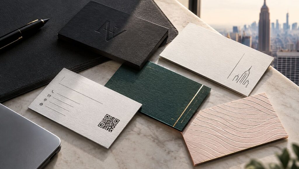
For companies exploring nyc business card services, this is particularly relevant because business cards are often exchanged during face-to-face interactions where the recipient can immediately see and touch the physical piece. The card therefore becomes a small but highly concentrated brand experience.
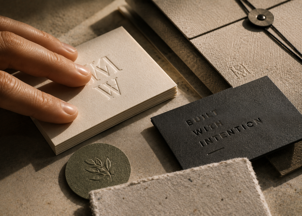
The Tactile Finishes That Can Transform Business Cards and Stationery
Tactile branding becomes especially interesting when translated into actual print production. Modern business cards can combine paper stock, coatings, dimensional effects, and metallic details to create different sensory experiences. The strongest results usually come from using a limited number of finishes intentionally rather than combining every available technique.
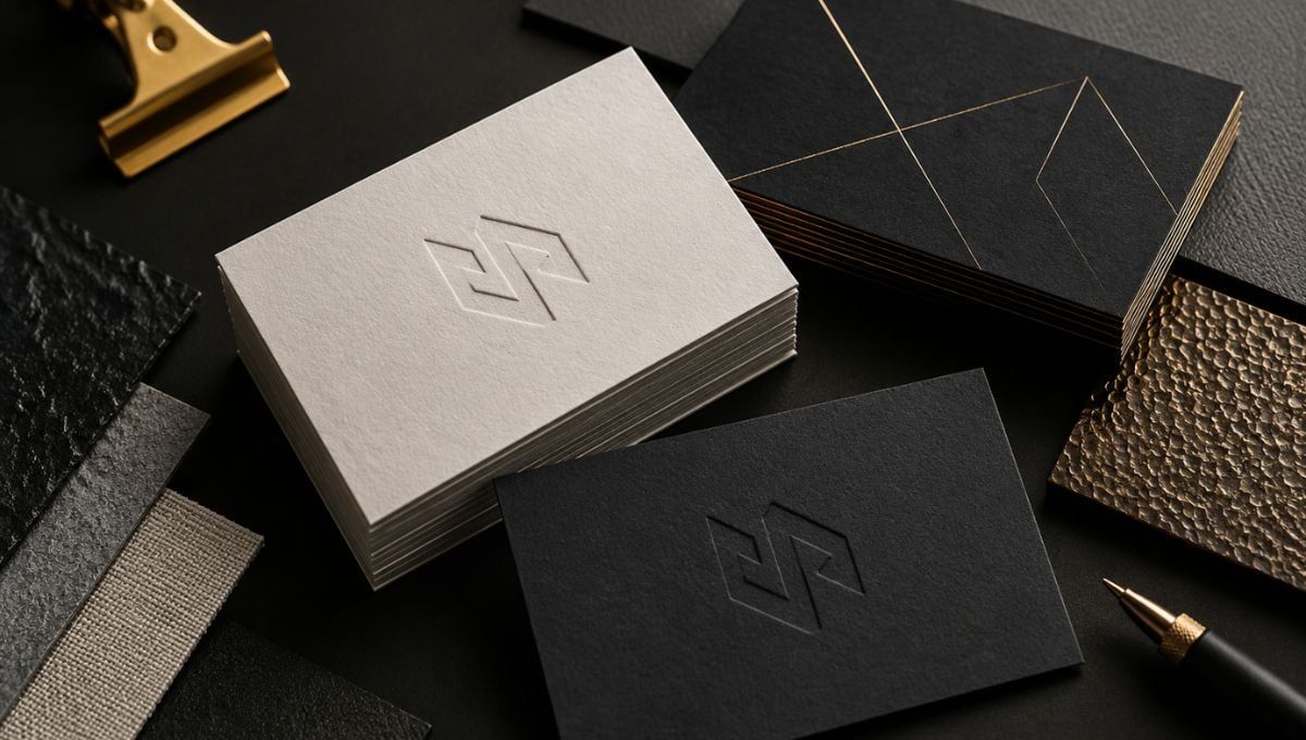
Embossing and debossing are among the most recognizable tactile techniques. Embossing raises selected elements above the surface, while debossing presses them into the paper. Logos, monograms, names, borders, and small graphic elements can all potentially be used as tactile features. Research into embossed labels has specifically associated embossing with perceived uniqueness and increased willingness to touch.
Soft-touch finishes create a completely different experience. Rather than introducing a raised or recessed element, soft-touch coatings create a smooth, velvety surface. Research on tactile packaging has examined soft-touch and raised coatings as distinct tactile experiences, with soft-touch surfaces described as having a warm, velvety feel.
Textured and uncoated stocks can communicate character without requiring elaborate finishing. Natural fibers, subtle grains, and paper tooth can make stationery feel more organic and material-driven. This can work particularly well for brands whose identities emphasize craftsmanship, sustainability, architecture, fashion, food, hospitality, or handmade products.
Foil stamping introduces visual contrast as well as a different surface interaction. Gold, silver, copper, and other metallic effects can be combined with embossing or premium paper to create a sophisticated result. However, metallic effects should reinforce the hierarchy of the design rather than overwhelm it.
Other tactile possibilities include:
- Raised UV details.
- Letterpress-style impressions.
- Edge painting.
- Multilayer or duplex stocks.
- Die-cut shapes.
- Specialty textured papers.
- Contrasting matte and glossy surfaces.
- Thick stocks with substantial physical weight.
The best luxury business cards nyc are not necessarily the ones with the most effects. They are the ones where the stock, typography, color, finishing, and tactile elements work together as one coherent identity.
For example, a minimalist black business card with a subtle embossed logo may communicate luxury more effectively than a card covered in multiple metallic effects. Likewise, a natural uncoated stock with a restrained debossed logo could be more appropriate for an environmentally focused design studio than a glossy laminated card.
Tactile branding is therefore fundamentally a design decision before it becomes a printing decision.
How Brands Can Use Tactile Branding Without Overdoing It
The biggest mistake with tactile branding is assuming that more physical effects automatically create a more premium result. In reality, restraint is often what makes tactile details noticeable. If every element is raised, metallic, glossy, textured, or oversized, the individual details can lose their visual and tactile hierarchy.
A better strategy is to identify the one or two physical characteristics that best express the brand.
Start by defining the intended personality. A luxury real estate firm might want its stationery to feel substantial, elegant, and understated. A creative agency might prefer unusual textures, unconventional dimensions, or contrasting finishes. A law firm may benefit from restrained typography and a substantial stock rather than decorative effects.
Then consider the entire customer interaction:
- What does the recipient see first?
Establish a clear visual hierarchy before introducing tactile elements. - What should they notice when they touch the piece?
Decide whether that should be thickness, softness, texture, or dimensional printing. - Which brand element deserves physical emphasis?
A logo, monogram, name, or key graphic can become the tactile focal point. - Does the material support the brand’s positioning?
Texture should make sense with the company’s personality and audience. - Does the finish remain practical?
Business cards are handled frequently, so durability and legibility still matter. - Is the combination visually coherent?
Paper, ink, foil, coating, and dimensional effects should be designed together.
This principle is supported by research showing that tactile and visual cues interact rather than functioning independently. For example, studies of packaging have found that visual characteristics such as gloss can influence perceived haptic properties, while research into luxury packaging has demonstrated that the effect of visual texture can depend on typography and other design choices.
This is why professional nyc business card services should involve more than simply selecting a paper stock from a menu. The design team and printer need to consider how the finished piece will actually be handled and perceived.
For brands pursuing a premium identity, tactile branding can also become part of a broader stationery system. Business cards, letterheads, envelopes, presentation folders, packaging, and promotional materials can share compatible materials and finishing principles, creating consistency across physical touchpoints.
The result is a brand that does not merely look premium. It has a physical identity that customers can recognize through interaction.
Conclusion
Tactile branding is ultimately about making physical design meaningful again. In 2026, as brands compete across increasingly crowded digital environments, texture, material, weight, and dimensional finishing provide opportunities to create experiences that screens cannot fully reproduce. Research into haptics and sensory marketing supports the idea that touch can influence product evaluation, while recent studies of packaging and embossing continue to demonstrate relationships between physical or visual texture, perceived uniqueness, quality, and luxury. The key is not to add texture simply because it is fashionable, but to select materials and finishes that communicate the right personality.
For businesses investing in business cards in NYC, this can mean turning a standard networking tool into a carefully designed physical brand experience. Whether you are considering textured stocks, embossing, debossing, soft-touch finishes, foil, or other premium techniques, Japan Printing can help bring the concept from design to production. Contact Japan Printing today to quote your custom stationery or business card project and create a tactile identity your customers can see—and feel.